Comprehensive rebranding for SITE.
Following the inaugural publication of SITE, we were asked to transform the brand by its founder, Cairo Clarke, culminating in the reinvention and launch of its new identity. SITE is an initiative that explores artistic practice through engagements with research, writing and performance, supporting those who are under-represented in the arts, and releasing a publication annually. Working closely with our client, we developed an extensive brand system to include a new logo, typography and colour; these elements became the graphic language that formed the backbone of the rebrand.

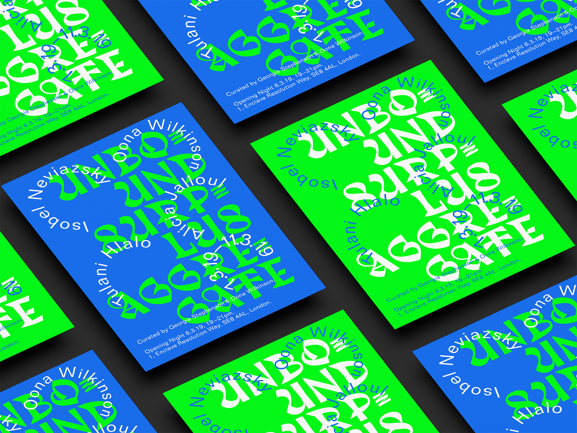
Considering the brand’s core aesthetics, we focused on creating a more timeless vision whilst retaining the minimalism that it already embodied, exploring how to relay a feeling of airy space with a contemporary approach. Collaborating with our client over a three week period, we identified a new colour choice to reflect the organisation’s voice. To move away from their previous use of neon green, our team carefully considered a different shade of green that reflected a balance of aesthetics without being too conspicuous visually, with a more neutral tone that would not become outdated. To determine a font for use across their visual content, our selection was based on functionality and flexibility. The typeface ‘Sages’ by designer Floriane Rousselot was used as a key element, and divided into two versions: filled and outlined. The filled design held clean and crisp characteristics, while the outlined form was successful for giving a sense of light and space to layout compositions. The font combined boldness and legibility when filled, and portrayed a modern and industrial appearance in its outlined form. The distinctive type was used across the identity system and on a range of digital and printed material, including a Facebook banner, posters, bookmarks, business cards, invoices and letterheads. Our work also extended to the design and curation of the story highlights for the project’s Instagram page. Influenced by the visually exciting forms of the chosen font’s lettering, we created aligned covers by placing an individual letter corresponding to the beginning of the highlight’s title on a contrasting background, referencing the alphabet to emphasise the written basis of the platform.


Through sustained collaboration with our client, we gave shape to the organisation with branding that can be adapted as their future projects evolve. SITE have used our distinctive visuals as they launch new ventures and continue their Instagram highlights by utilising our strategy, adding more letters as these expand, creating an immediate connection with the audience and establishing a consistent voice throughout their content. Our developed approach has opened the door to new perspectives and given a voice to their work, encouraging conversation and collaboration as they launch new initiatives and publications.


Related