Developing Unbound Surplus Aggregate’s visual identity.
Contemplating an otherworldly terrain, the body, and construct of the self, our studio collaborated with curators Georgia Stephenson and Oona Wilkinson to develop the visuals for their all-female exhibition ‘Unbound Surplus Aggregate’ at Enclave Projects. Stephenson is a curator and art director and Wilkinson is an artist and curator; the pair formulated the show exploring an imagined landscape for our ways of existence. Considering concepts of surrealism, identity and the extraterrestrial, we designed the exhibition’s Facebook banner, press release, poster and window vinyl.
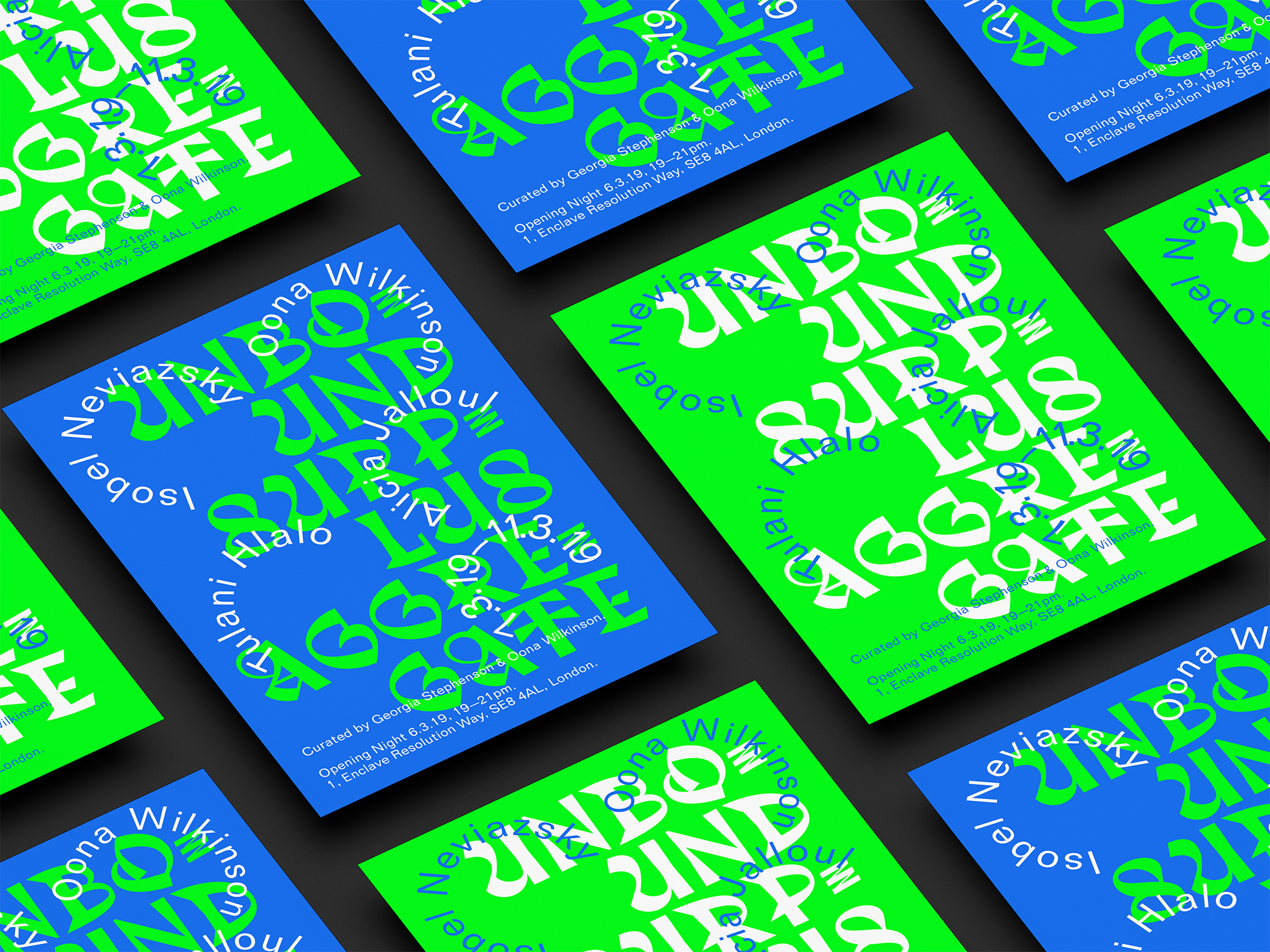
Responding to the themes engaged by the show, we selected the typeface ‘Trickster’ designed by Jean-Baptiste Morizot for its dissent of convention and link to folklore and mythology, to be used for the visual assets. Combining this with looping text for the artist’s names created a visually intriguing composition of abstract shapes, curves and layers, coalescing with the links of interconnectedness and surrealism explored in the show. Components of our design imitated the analogue processes applied by the artists, echoing the textures of the works that would be displayed. Interweaving rhythmic, soft and smooth forms, we responded to the femininity of the exhibition in a subtle and unobtrusive way. The type floated on the poster, defying gravity, referencing the alienness of the exhibition and evoking a playfulness that tied in with its approachable tone. The posters featured saturated green and blue colours, correlating to the concept of a heightened unfamiliar landscape. By utilising a two tone colour system to keep the content clear, our priority was for a reduced palette to better highlight the exhibition’s title and the artists involved. Moreover, to harness a digital aspect, we collaborated with graphic designer Aaron Daniels to animate the poster, achieving a river-like fluidity that enhanced the focus on an unidentified world. When designing the press release document, we focused on the concept of an expedition to someplace unknown, employing the structure and scale of a postcard to communicate this effectively. The curators also asked our advice on a fitting writer for the project to write the press release, and we recommended Charlie Siddick, a contributor for our partner platform DATEAGLE ART, following the piece ‘A Universal Gaze’ that she had previously written for us which linked to the show’s constructs.


Resulting from our visual strategy, the social media posts related to our poster design amassed 319 views and 337 likes, establishing an online audience for the exhibition who were then prompted to visit the show physically. Our team handled the entirety of the show’s printing requirements, including price and quality comparison and follow-up communication with the printers to ensure the posters and press releases were available in the gallery space at the necessary time. Another aspect that we managed was the printing of vinyls for the gallery windows, a task that first required precise measurements on site, but then allowed a playful deconstruction of elements of the poster onto the windows. Using a dynamic approach, we organised the display of the poster and press release within the gallery so they were visible from the outside, a strategic move to incite viewers passing by. Dividing the printed materials into separate piles of their front and back, we created the illusion that there were more flyers while demonstrating the two sides to our design, alluding to the show’s surrealist context.


Related