


Pulling faces: the disparity of self-expression.
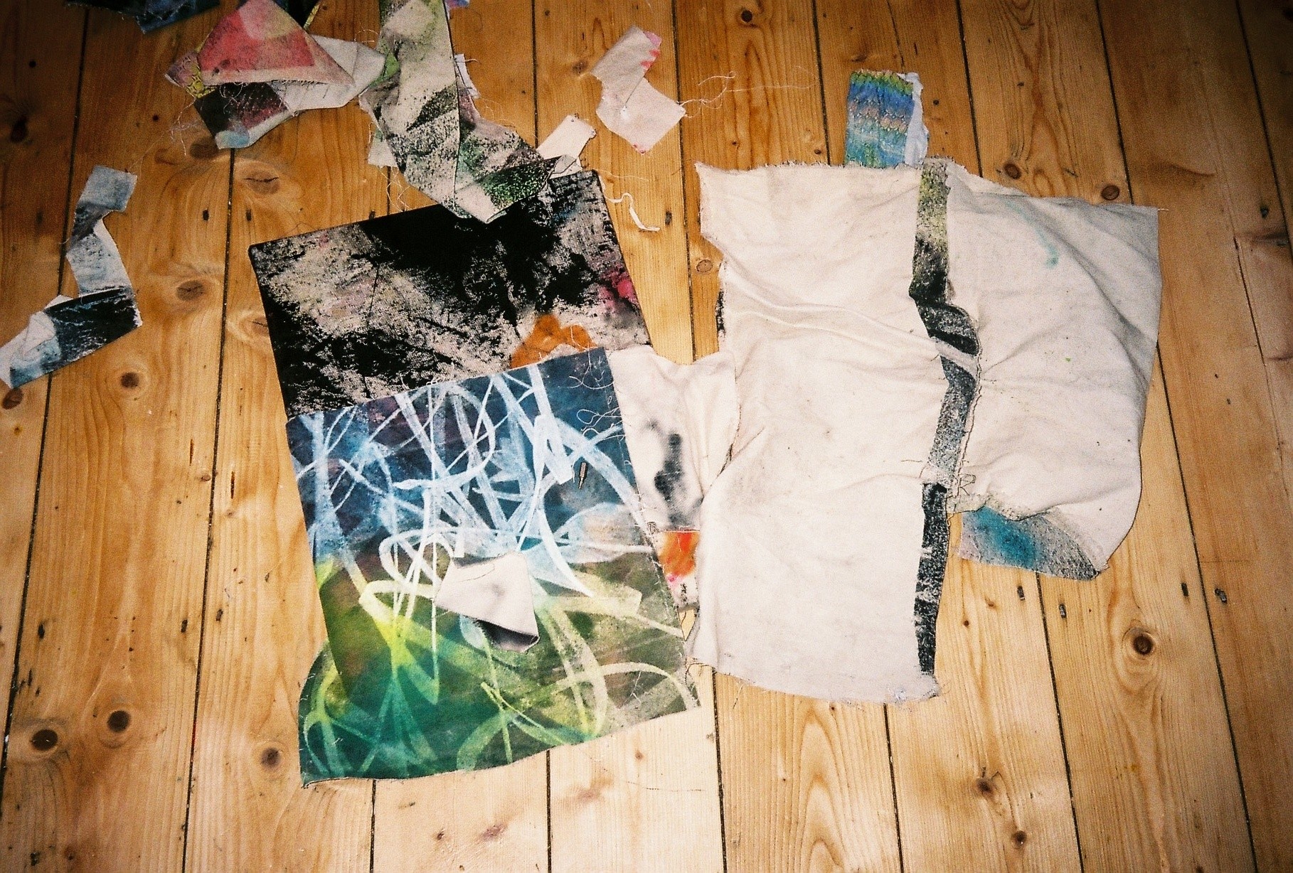
Artist Daniel Fletcher depicts the complexity of human expression through layers of abstract mark-making. He works intuitively, building emotive compositions from bold, darting lines. Faces are a regular occurrence throughout his work, often splintered or manic in appearance. They take on new life forms of their own, escaping the immediate canvas of which they were first conceived. The artist combines traditional methods of painting and screen-printing to achieve a rough appearance, created with a controlled outcome. He explains he enjoys harnessing “the level of control and precision” that screen-printing lends, compared with the “contrasting freedom of working with paint, oil bar and graphite.” Adding that he likes “the tension between the two.” His collection of works often echo Fletcher’s own personal feelings, these including sadness, joy or anxiety. Nameless, without set identities, floating facial features become ambiguous modes of expression. The structure and positioning of each component communicating a shared visual language, minus the presence of speech. Fletcher often works on bodies of paintings simultaneously and this can be seen through the similarities in colour and form between each canvas. This method allows him to work on multiple ideas at any one time, often pausing mid-process to divert his attention before it later returns… When I visit Fletcher’s studio, he also reveals a major project he’s been focussing on alongside his practice. Foolscap Editions is an independent publishing project in which he collaborates with other artists to produce publications. I called into the artist’s Hackney-based workspace to find out more about this new art-led project as well as his artistic approach, where he visually interprets raw feelings.
BACKGROUND
You didn’t follow a necessarily ‘traditional’ route into painting or fine art, can you explain what made you want to create in the expressive form you do?
While at university I quickly realised that I didn’t enjoy trying to communicate other people’s ideas, I just really enjoyed making the work for myself. I felt frustrated trying to make my own work fit to someone else’s brief. Despite not studying a traditional Fine Art course, I was fortunate that I had a really strong network of peers who were and so I was never short of the opportunity to gain critique on my work from this perspective. On leaving university, I began working for fine art silkscreen printers (Make-Ready). I was involved in printing some really interesting and ambitious pieces for artists. This period of time had a big impact on my practice and me, and opened my eyes to a different way of approaching print and making work in general. It was shortly after this that I began developing these large unique silkscreen works on canvas that were really pushing what could be achieved with the process. I was in quite a unique position to be able to be both the artist and the printer, which opened infinite possibilities in my work; it was a really exciting time.
What’s the most valuable experience you gained from your Illustration and Visual Media studies at LCC?
A lot of my tutors were practicing artists in their own right and my course in general was quite open and free, we were able to follow a relatively independent program of study, which was good. I was originally drawn to the university, as it was formerly the London College of Printing. They had outstanding print facilities and this was something that I knew I was keen to incorporate into my practice. I found my niche working with silkscreen and learnt a lot from the technicians.
Your other commitments include working part-time as a university technician; can you explain how this aids your practice and time management? How do these relationships add value to both party’s creative output?
I have always found that it is very liberating for my work and practice to have a job that pays my bills, in particular in the sense that I don’t have to rely solely on income generated by my work to live. This means that I feel completely free to grow and develop my practice how I wish, which I personally think is valuable. I also find that it makes my time in the studio very focused. I have a strong routine and have never felt too held back by working part-time. I work at a university as a technician in Offset-Litho and Print Finishing that is essentially helping people make and self-publish books. It is rewarding working in the university environment with students who are at an important stage in their development.
WORK
Abstract faces are a common motif throughout your work, do you intend for these to have set expressions or are these open to interpretation from the viewer?
The presence of faces and expressions is the cornerstone of my practice and the starting point from which I develop my work. Each face has its own character and expression or mood, however I think that this is sometimes quite subjective. I find the overall idea of “expression” intriguing particularly as everyone will have different associations with colours and mood. I have always been interested in how mood can be portrayed in abstract work. A level of ambiguity is important in the work as it helps cloud the reality. This idea of reality / fakery is a broad sub-theme that is also continually referenced throughout my work. Often, people who are new to the work don’t pick up on the faces straight away and this is something that I encourage within the way I compose the pieces. The work can be read on two levels: as playful portraits but also at face value as abstract compositions defined by their formal values of mark, shape, colour and tone. Although all I see is the faces in the work, I like that they are not obvious to everyone – it’s one of those things that once you know it’s there you can’t miss it. I like the idea that a piece that is approachable and friendly on the surface actually portrays a distraught and sad face full of pain. It is deceitful that something so full of pain could be hidden behind something that appears so easy. I liken this to the way we are able to present a polished version of ourselves online when inside the reality could be different. This notion of camouflaging reality interests me. The abstract language is an important tool in making dealing with emotions accessible.
Are the figures that appear in your work based on people you know from memory, autobiographical or representative of a pivotal time in your life or are they purely fictional characters?
I view them as faceless portraits of universal emotions and feelings. Portraits of everyone, for everyone. Generally, the work is not autobiographical, and instead adopts a common voice or persona. I do make some biographical works that reflect my own current mental psyche, however these are not signposted in any specific way. I am keen for the work to be universal and one of the ways I do this is by exploring familiar tropes.
Your works seem to depict scenes of either lone individuals or chaotic compositions featuring multiple personalities, can you explain the absence of a middle ground between these two contrasts?
This is a really interesting point and one that I only really considered when you came to visit me in the studio. It is something that has happened unconsciously. I think ultimately that both the lone figures and the group compositions communicate a sense of social isolation. Either being lost in a crowd or lost in yourself. I sometimes feel anxiety in social environments and this is something that is reflected through ambiguity and camouflaging of expressions in the work. A masking of personal feeling. I have only made a few pieces that contain two figures and these have been more biographical pieces that depict my girlfriend and me. I think our close relationship reflects the sense of unity that carries through into this work, bringing a feeling of intimacy to it.
Your style can be seen as revealing and raw take on traditional portraiture. What are your thoughts on the ever-present need for humans to showcase the best version of themselves and how do you think your work in unravels this notion in comparison?
The social media stage encourages us to always portray the polished version of ourselves and sometimes the boundaries between who we are online and in real life can become blurred. It can become easy to view others portrayals on a superficial level, which can heighten our own insecurities. Social media by its nature is very much about individual egos or identities; my work differs from this and more traditional portraiture in that it aims to reflect the broader notion of a universal feeling rather than an individual personality. I am interested in the blurred line between actual reality and the reality we like to portray, and for me this line manifests itself in the abstract language I use to build up the work. There is honesty to the direct and instinctive way in which the faces are initially composed in grayscale from just their fundamental and basic elements (often only eyes and a mouth). This is contrasted by the expressive abstract language I use to render these faces, the make-up that gives the individual pieces their personality. This juxtaposition mirrors our ability to outwardly present a polished version of ourselves with the rawness of the basic forms contradicting the attractive facade that they hide behind.
Some of your titles include playful phrases including ‘A dinner with friends’ and ‘Lost in space.’ Do you always think of the titles for your work beforehand, or do they come to you naturally once you’ve finished a piece?
Titles often come to me during the process of making the work. Sometimes I may have a fully formed piece that does not have a resolved title, other times I have a title in mind from the outset and this informs the development of the piece. It is important for me that there are no barriers in the creative process and I am happy for the work to lead in whichever way is natural. I like to leave work in progress and completed pieces on the wall of my studio to reflect on titling. Titles often come to me while I am travelling about and listening to music and I keep lists on my phone and on paper that I refer back to. I generally have two categories of titles, ones that are more literal and descriptive or ones that have a conversational tone to them.
How has your technique developed since you started creating the works on canvas and what do you enjoy most about combining multiple mediums like screen printing and paint?
Working on canvas has allowed me to use fluidly and without restriction the various techniques and materials I require to develop my work, it has also allowed me to be unrestricted in the scale that I work to. I spent a valuable few months last year taking things back to basics and trying out different materials, substrates etc. Although it was quite frustrating at the time, it allowed me to bring together a load of technical loose ends further freeing up my process. For me, the decision to work with silkscreen was always a clear one. I wanted to be able to create really flat and seamless planes of colour. Due to my previous work in the silkscreen field from a commercial perspective, I am fortunate to be able to work very intuitively with it as a primary process of making rather than a process of reproduction as it can be regarded. It is very naturally ingrained in my practice. Despite a lot of my earlier work being solely silkscreen on canvas, I never really thought of myself as a printer – my silkscreen practice was heavily grounded in painting, drawing and cutting bits of paper to build up compositions and so rather than delivering paint directly to canvas with a brush or masking tape, I was doing so via the mesh of the screen to help gain the flatness that I desired. It has been a very natural progression to start incorporating this previously discarded painted work into the finished pieces. I like harnessing the level of control and precision that can be achieved with the silkscreen process with the contrasting freedom of working with paint, oil bar and graphite. I really like the tension between the two. The one element for me that was missing with the silkscreen was the variety of surface quality I could achieve, and this is something that has been exciting to expand on as I have begun to work more directly with paint.
Your mark-making has a childlike, naive sensibility to it. This is in harmonious juxtaposition with the form and layout to which you assign these marks. Can you explain how you achieve this aesthetic?
The naivety comes from the very instinctive way that I make marks and draw, I have never been particularly good at drawing in a traditional sense but was always drawn to mark making as a means of expression. I really like contrasts in the work for example between soft and hard marks or very quick expressive marks against grounded forms. The way I work with paint stems from earlier silkscreen work. I used to build up compositions from very loose quick marks and then position and print them in carefully considered places on the canvas – something the silkscreen process allows for. I often work from some kind of sketch or maquette when making any of the larger and more involved works on canvas. I make preparatory sketches at reduced scale with pencil and paper but also digitally. I like the pure freedom of sketching and composing digitally. The fundamental structure of the faces is really important to the work, and so the compositions, although they sometimes appear to be quite loose, are delicately balanced. I sketch out approximate areas where certain elements are going to be on canvas so I am able to maintain the overall compositional balance that I am looking for. This also allows for me to focus on the making of individual marks and forms and on the application of the media.
It’s really interesting how some of the works seem to escape their canvas confines and disappear completely from sight. I think it invites the viewer to explore the image further in their own mind. Is this an intentional or accidental outcome?
I find myself very drawn to the edges of the canvas in my compositions, and frequently aspects will bleed around the edge of the stretcher. I view the canvas as a 3D object and it seems unnatural for me to stop artwork dead at the edge. In a lot of my most recent work I have been making a lot of compositions on a white ground. I like the way it allows different marks, forms and colours to bounce and reverberate off each other almost removing gravity from a piece. I always imagine the shapes that intersect the edge of the stretcher as full shapes rather than just what remains within the finished perimeter – this probably stems from the way I use cut paper shapes to help in the forming of compositions. I think extending the artwork around the stretcher suggests a crop of something that is flowing rather than something that defined finitely.
Can you explain your choice of colours, some works seem linked in their use of bold and simplistic palette. Is this a result of working simultaneously on multiple pieces?
Colour is a really important aspect of my work. I often make my maquettes and initial compositions in greyscale, so I can get down the fundamentals of any facial remnants. It is through the addition of colour that I am able to give pieces their individual personality and tone. Colour is essential for me in defining the mood of a piece. Sometimes I have a colour palette in mind for a specific work and this defines other decisions made in that pieces development. I do find that I gravitate towards certain colours or combinations of colours over periods of time. I think that subconsciously links between colours occur between pieces due to the fact that I develop my work in bodies and work on a few at one time.
What attracted you to the muddy yellow, you’ve used a lot in your recent works?
I really like yellow at the moment. A lot of the work you saw in the studio I was making while it was still grey and miserable outside. I think yellow is a really versatile colour that has quite a broad spectrum ranging from rich orange or golden through to murky greens. It can feel extremely positive but also sometimes quite unsettling and jarring in certain combinations.
Is there a connection collectively throughout your complete body of works or do they each tell an individual story?
I always develop work in bodies and although every piece can stand alone, I always like to think of an ongoing dialogue between works with different pieces bouncing off and having conversations with each other. In general, bodies of work don’t have a specific topical or thematic slant.
Can you talk us through some of the emotions you convey through your work and how you approach communicating these effectively?
The work encompasses many different specific emotions; sometimes pieces are more broadly about a general mood such as something that just feels positive or negative. It is hard sometimes to pinpoint our own emotions or how we feel and I imagine everyone could read things in a different way, which I welcome. We do not project our feelings through our expressions all of the time and some emotions don’t really have a facial expression attached to them. What cannot be expressed through the crude forms of basic facial features can be expressed through the use of colour, application of paint and the nature of the mark making. I often feel that a powerful sense of mood can be communicated through the abstract language itself exclusive of any physical signposts. Specific emotions are normally reflected fundamentally through the basic form of an expression; the suggestions of eyes and a mouth using either line or shape. Very slight changes of the angle and position of these elements have a big effect on the tone or emotion. I have spent time researching and looking at satirical and comic artists – it is insightful to break down the techniques they use to conjure different emotions from restricted palettes of marks. I enjoy making work that has anxious or sad undertones but like being around and looking at pieces that make me feel happy. The actual process of making the work is quite a therapeutic release.
How much does your personal emotional experience influence your creation process? And can you describe how you layer textures, shapes and lines to visually translate these psychological states?
My general mood and state of mind definitely has a bearing on the work that I produce but not necessarily specific of biographical events. I adopt an abstract language as a critical tool to communicate my sense of a feeling or state of mind. I work a lot with contrasts; soft marks against hard edges, brash bright colours against subdued tones, controlled delicate strokes against impulsive bold lines. I use contrasts like this to create tension or excitement and energy. Some works are much more built up and chaotic whereas others are more stable and calm with solid grounded forms. I often think about pace in a work; how loose outbursts relate to more controlled marks and movements. I think a lot of energy can be imparted through the mark making. There are many different things going on all at once and a lot of these things may happen in a moment without thought. Subtle nuances in any one of these things can make or break how something feels or whether it looks or seems right. It is difficult to put into words how or why the specific visual techniques work as it is an instinctive and subconscious process.
FUTURE
You also have a few larger works, do you enjoy working to this scale and do you have plans to work on at a bigger size going forward? If not, how would you like to develop your practice further?
I really enjoy working at a large scale. I think at scale the work starts to have more of a physical presence – I like the idea of standing in front of a face that is much bigger than me. It would also be interesting to think how mark making implements could change too as I increased scale. I definitely want to continue to develop larger pieces. One of my most recent pieces I have made was a large diptych. The two separate panels could be installed butted up next to each other as one large work or read/displayed individually. I have quite a few ideas for paneled pieces and this is probably what I am going to work on next in the studio.
Some of your older pieces are a lot more minimal, simply using only graphite on raw canvas. Is this an idea you plan to return to?
I enjoy working on the surface of raw canvas and will definitely revisit this; I have been thinking lately about making a new body of work on unprimed material. I have some Belgian linen that has a really nice coarse surface. I think it would give some of the work a more subdued tone that could compliment the brighter more brash pieces. I like the simplicity of working onto the raw canvas and definitely would like to return to it. The immediacy of drawing straight onto the canvas is also appealing and allows the work to be much more about the line.
You also run Foolscap Editions, an independent art publishers alongside your own work. Can you tell us more about the project? What can we expect to see coming up for Foolscap editions? Can you tell us what artists you’ve been or plan to work with?
I have been working on Foolscap Editions for almost three years now alongside my practice and have collaborated closely with a number of artists to generate publications and other printed matter. I have always been interested in the book as an exhibition space. To me the book as a form is a very concentrated space that can facilitate interaction with artwork in a focused way as we do in the traditional white cube space. I want to work with artists closely to present carefully curated selections of work. I think that an individual’s artist practice is the product of many different components, influences and interests that are complexly linked and bought together. Part of what I want to do with the artists with whom we collaborate is to offer up the space of the book to present some of the foundations of their practices that may not always be presented in the more traditional exhibition format. Other than attending a couple of small book fairs none of the work has been formally released yet. 2019 is going to be an important year for Foolscap, as it is going to see the launch of our website and the subsequent release of the last three years work; I am really excited to be able to share all the projects that we have worked on. Currently, I am finalizing a publication and edition with artist Lucas Dupuy. We have been working closely on this project for over a year now and it is the most ambitious Foolscap project to date. Things are busy at the moment getting it ready to print at the end of July. To keep posted with our upcoming launch then our instagram @foolscap.editions (which is currently rather neglected) is going to be our main channel of sharing the projects and publications that we are working on.
30.08.19
Related