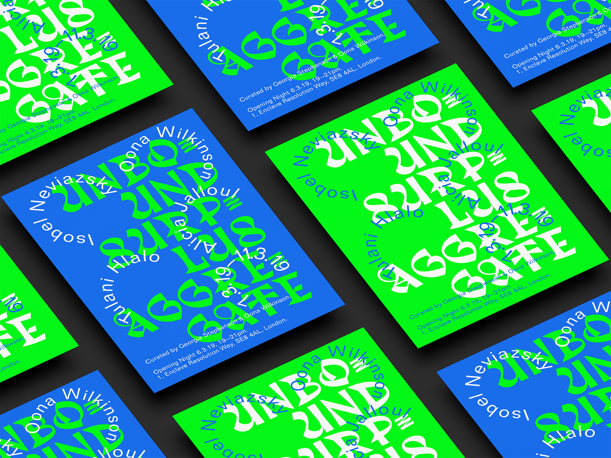
Integrative design and direction for ART WORK magazine.
Approaching the release of ART WORK magazine, founder and editor Róisín Tapponi commissioned us to collaborate, direct and format this exciting issue. With a focus on slow and quality writing, it addresses systemic racism in contemporary art by platforming marginalised artists and writers. Liaising with the many stakeholders, our studio developed a dynamic branding that united the written and visual musings of the eleven contributors throughout the e-pub. Our consistent approach across multiple platforms homogenised its aesthetic presence, channeling diverse voices through a shared identity.

Responding to the initial poster for the magazine’s fundraising event, we decided to maintain the neo-grotesque NimbusSanL typography, blue foreground and grey backdrop for the ensuing work. Considering its geometric components, we transformed the squares from the poster into spiky thorns that interconnected the many elements of the magazine. These sharp figures permeated each segment with directionality, movement and tension as their precarious tips pointed closely to the names of contributors on social media posts and throughout the magazine. As each creative had a different vision for their submission, articles, essays and poems ranged in composition, format and length. Whilst considering the overall aesthetics of the publication, we respected the individuality of each piece, working closely with the many correspondents to achieve satisfactory results. Integrating playfulness, rhythm and surprise, the magazine’s texts were infused with paced indents, toppling columns and spontaneous spacings. Considering the strong text-focus, we translated the numbering style for each sheet into words and digitised a hand-written piece, homogenising the passage with the overall graphic feel of the magazine. As we regularly sent drafts to our client for approval, we also advised them on dealing with the acquisition of an ISSN number. While the publication was originally intended to be printed, our team recommended to sell the material on electronic publishing platform Issuu. Given the Covid-19 outbreak and the undesirability of purchasing magazines in stores, moving ART WORK online delivered a more environmentally-friendly product, saving money on printing and distribution costs while widening their outreach to non-city dwellers. By allowing readers to zoom in on words, access the participants’ websites via hyperlinks and engage with the audio version of a text, we increased accessibility to the visually-impaired and to those who struggle to read longer pieces.


Having reached a thousand followers since launching, our team have created three months of Instagram content for ART WORK with individual templates including the name, portrait and a sneak peak of each writer’s work. Using a mix of casual and formal posts and photography, the feel of the feed has become more human, relatable and relaxed. Following the unveiling of ART WORK’s inaugural issue, over thirty editions have been sold, receiving great feedback for its art direction and design. Having attracted the interest of numerous book distributors, the magazine’s founder has expressed her great satisfaction with our services by inviting us to work on the forthcoming issue in January 2021.


Related
Brand & Design

SITE
Brand & Design

