


Pastel hues and mesmerising blues.
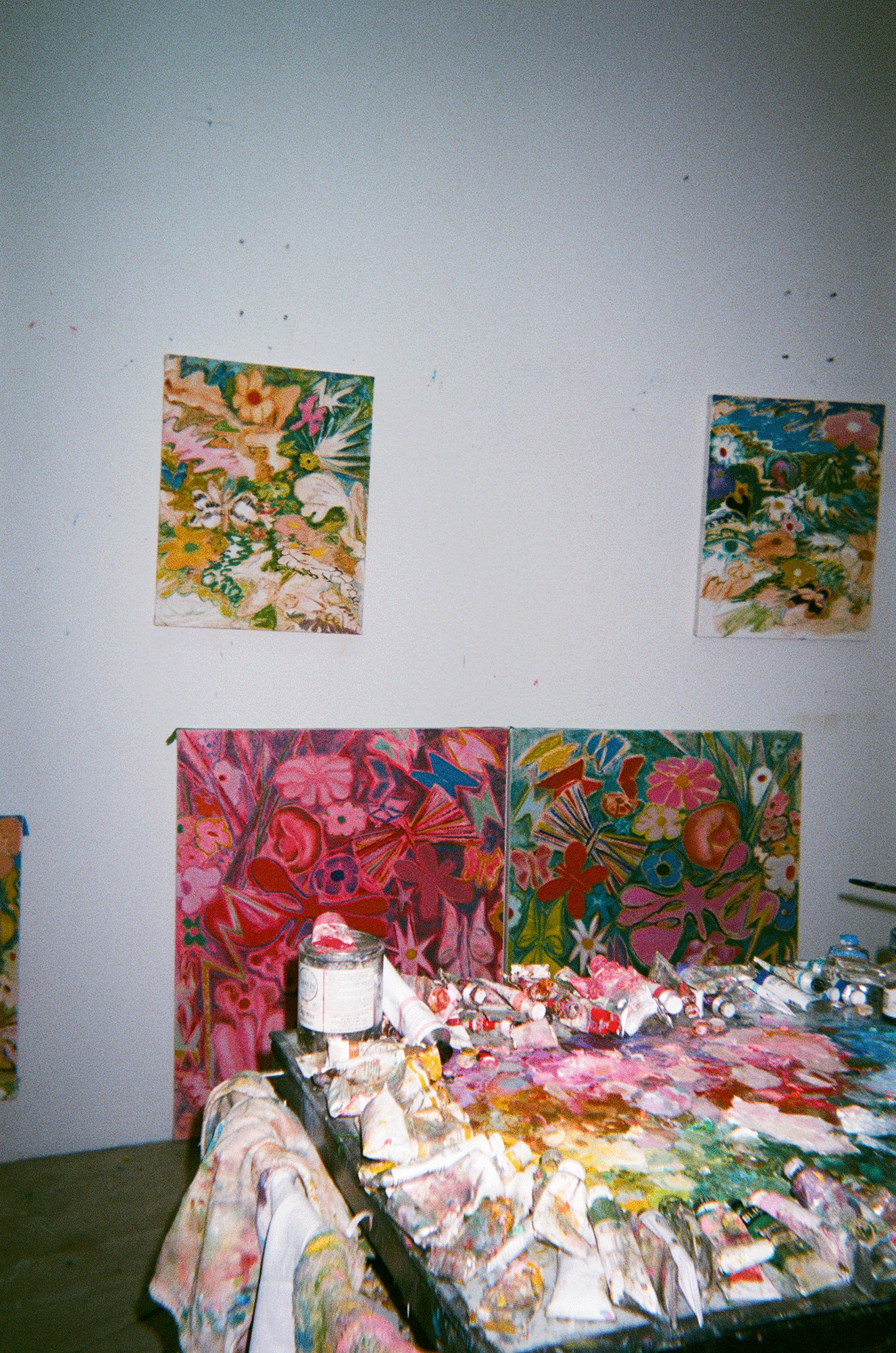
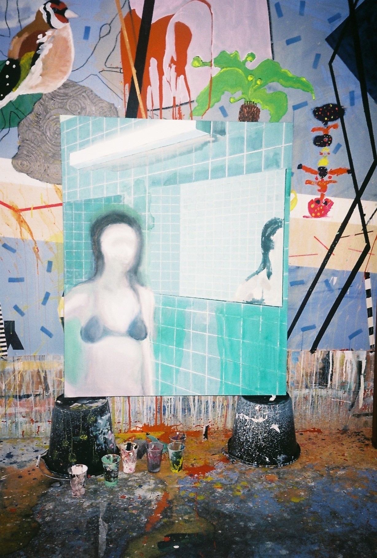
Since moving to Los Angeles from New York in 2017, Matthew F Fisher’s paintings of nowhere beaches and organic forms continue to develop, as does their synergy with the sun-soaked city. Fisher’s distinctive horizon line paired with rock motifs, beach and sand are complimented by his colour palette, which is defined by his use of pastel hues and mesmerising blues. The artist celebrates his choice of imagery for being both universal yet deeply personal, and continues to follow the rule: ‘no layer will be painted only once’, which ultimately creates work that forms a unique density of colour and texture. Located on the West side of Los Angeles, Fisher’s studio is occupied by not only his art works and acrylic paint but also a number of discarded dictionaries, which he finds on the streets of Inglewood; a source of inspiration for titling his works. Referring to his studio as a laboratory, a place where he can conjure up new images from his mind, Fisher is currently preparing for his solo show ‘Soft Nature’ at Ochi Projects. DATEAGLE spent time with Fisher and his tropical Hawaiian shirt to learn more about his fascination in taking from life, and creating memories for future painting ideas.
BACKGROUND & STUDIO
As a full-time artist are you typically in the studio Monday – Friday?
Most weeks find me in the studio on about 6 days. Balancing my partner’s creative schedule, you’ll find me there for about a half a day. We have a 2 year old who recently started nursery school, so I have been getting those school hours in the studio. Parenthood has forced me to make the most of my time, both inside the studio and outside of the studio. Not a wasted minute.
Your works focus heavily on beach imagery paired with abstract landscapes – with this in mind, do you ever paint en plein air or always from memory, in the studio?
Although my work is a constant reference to the outside world, I’m not interested in the idea of painting directly from it. Rather, I am more intrigued by taking from life by creating memories for future painting ideas. Once back in the studio, I painstakingly translate these memories into a new image. The studio is my laboratory, a place where I can create something new from my head. That being said, there’s an importance to always being in the world, of always looking and seeing, keeping those memories fresh.
WORK
Can you talk me through your painting technique?
Acrylic was never taught to me in art school. It was always viewed as the lesser medium compared to oil, a paint without history. When I moved to NYC after college, I had a bucket full of acrylic paint. The thought of using solvents and oils in my small apartment seemed so unhealthy and annoying. Thus, I started to paint with what I had on hand. Through those early years, I taught myself how to make an acrylic painting. As I fumbled with the paint, I pulled from my art school training, mainly the techniques of watercolour class. I paint big to small. Starting with the furthest point away and working forward. Simply put, sky first, then water, sand, and object. I have a simple rule that no layer will be painted only once. This creates the unique density of colour and texture found within the work.
Can you tell me more about the imagery in your work, which is often occupied by planets and organic forms?
This body of work started out with the striking idea of making a painting about nothing. One morning in 2011, I simply drew a horizon line, sun, beach, and sand. When I stepped back, I realised that this image was everything to me. I enjoyed how the motif was both universal and deeply personal. I have taken this duality approach to all of my imagery, to be as open as possible with the readings while still being deeply personal. I have found this, for example in the image of a seagull – a bird that is everywhere in the world and, at the same time, nowhere. I am less interested in the depiction and history of any one exact breed of bird as I am in the idea of ‘bird’ and how the viewer responds to that.
You use a distinct palette, which often includes vivid pastel hues and mesmerising blues – is there a particular reason as to why you generally stick to specific colours?
When you paint a lot of sky and water works, blue is the natural colour choice. Of course, that makes it extra fun to not use blue to paint sky or water… The more pastel colours are my reaction to the L.A. sun.
You have an interesting approach to naming your titles; using discarded dictionaries. Can you tell me more about this unique process and how it came about?
Ha, thank you for phrasing it like that! I deeply enjoy the found knowledge of holding a dictionary, the whole world is actually in your hands. The internet is so, so vast, that becomes almost useless as a tool to search for titles. By starting with the dictionary and an impulse, I often can find a specific term, name, or word that interests me and relates to the painting, thus creating a new layer of meaning. This impulse is often a name or word that is on my mind. Recently, I met my studio neighbour, Will. After he left the studio, I looked up ‘Will’ in the dictionary. In the process, I came across the term ‘will-o’-the-wisp’. It was an 18th century phantom of a ghost light appearing on the horizon at night, caused by the release of gas over a swamp. This light would often lead travellers off the path as they thought the light was a town or house in the distance. I looked at the painting I just finished off a sunset, and I couldn’t imagine a more perfect title. A title I would most likely never found, if not for this process.
You recently completed a residency at Passaquan through Columbus State University in Columbus, GA. Can you tell me how this has impacted your aesthetic and overall practice?
It was a deep pleasure and honour to be invited to Pasaquan by Columbus State University and spend a week surrounded by Eddie Owens Martin’s amazing environment. It was overwhelming at first, so strange, so out there. Not wanting to just appropriate his imagery into my own work, I worked as I would normally if I was at my home studio. After a few days of drawing, I had the idea to extend the outer circle from sun through the upper part of the drawn frame. By taking the imagery outside this frame, creating a larger circle, I saw that as my tribute to the mandalas that Martin had painted all over the buildings. A small but important reference to Pasquan that could only have been found by the time I spent working there.
Can you tell me more about the black rock motif that recurs in your work?
My original impulse was to be a shithead – how funny it is that this black rock occupies 90% of the picture plane creating a painting of nothing? The more I sat with the painting the more I started to understand the complexity of allowing this void to be the everything of the picture. There’s an extreme flat dimensional aspect that exists within all of my works. These rock paintings are the best example of this. At first, I struggled to figure out the structure of the ripples around the bottom of the rock. After many different failed starts, it occurred to me to make them as shallow as possible, as if the sea was a fax machine, and the rock was the incoming fax of a black square. This shallowness also counters the highly rendered texture found on the outer edge of the rock. These examples further empty out the void in the centre of the painting. This nothing is the everything of the painting.
Would you say that your practice has changed since moving from New York to Los Angeles?
In many ways it’s still the same: the studio is where I go to make art. But being here in L.A., one experiences the power of the sun daily, you can’t escape it. Unlike the south where it’s humid, or the desert where it’s hot as hell, L.A. is just right. You want to be outside all the time, all day. Quickly, this solar energy has fed into my work and attitude. I noticed an increased use of the colour yellow, a little dab to warm the whites, or those vivid pastels you mentioned earlier. Even though I don’t paint from life, this is a subtle reminder to me of how life creeps into the painting process.
FUTURE
You have a solo show at Ochi Project’s in January. Can you tell me about the body of works you have created for this show and your choice of titling?
The show is titled ‘Soft Nature’, a reference to the imagery within the work; as well, I hope, a reference to my own disposition. It is also the brand name of toilet paper in my studio building. I am big fan of chance and reason. After months of looking at this packaging, I knew I had my show title. The works for ‘Soft Nature’ are a continuation of my quest to paint everything through the zen of nothingness. I also have started to paint more objects, flowers, conch shells, and seagulls, to name a few. These paintings of things are a nice counter to the empty landscapes.
19.12.18
Related