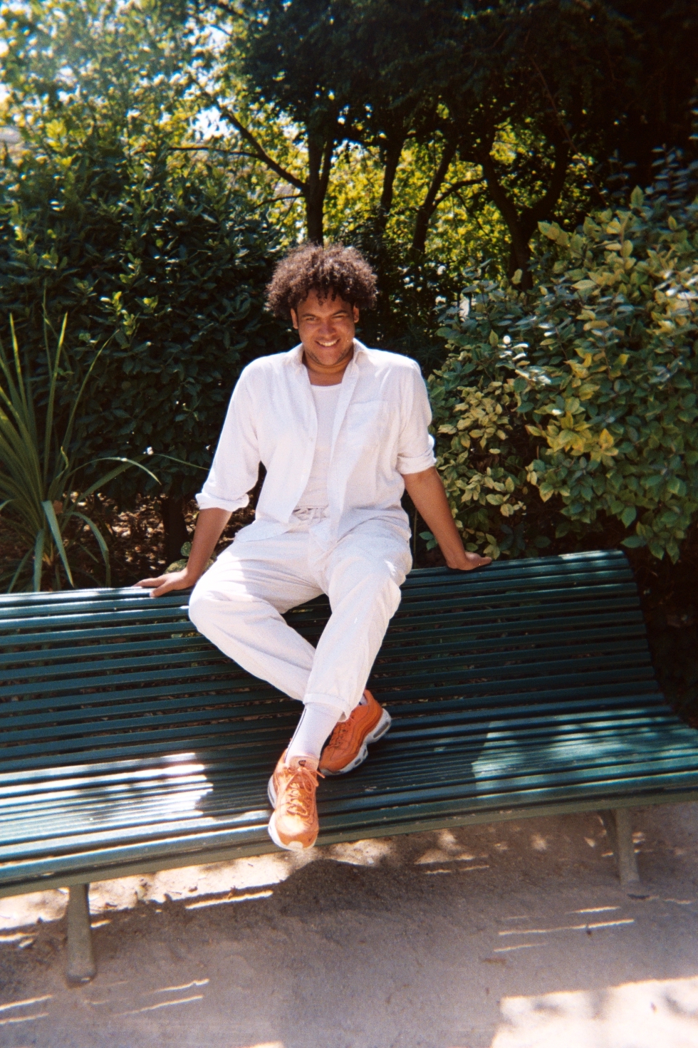


The observation of othering.
Through her satirical scenes, London-based painter, Olivia Sterling, frames narratives surrounding racism and the violent stereotypes entrenched in society. Characterised by the use of saturated colour and a slapstick visual quality, her paintings address often unnoticed micro and macro-aggressions through domestic symbols in a way that attempts to mimic the perception of living as a POC in Britain. In a figurative tradition extending from Boschian absurdity, to Rococo fleshiness, Sterling’s action-full, painterly and realist aesthetic brings together the humour and social commentary of R. Crumb’s underground comix with the bold and bright colours associated with Keith Haring’s street murals and Tom and Jerry cartoons. Accepting that her work “will always be about race, because everything is about sex, race, etc.” [at least that’s what it feels like]. Sterling’s focus is on embracing the inevitability of painting the mundane scenes that endeavour to obscure observations of othering. Forced out of her studio at the Royal College of Art during the lockdown period, she embarked upon a new series that referenced food and family, and specifically how Britishness is linked to treats that are fatty, kitschy and often ugly. These sticky paintings resulted in the solo show ‘It Clings Like a Leech’ at GUTS Gallery, London that used the metaphor of a leech to examine the process of unlearning stereotypes, traits, and values that are thrust onto us from youth. This summer, Olivia will receive her first major institutional solo exhibition at the Goldsmiths Centre for Contemporary Art in London.
BACKGROUND
Having spent your childhood in Peterborough, were there any defining moments or important aesthetic encounters that first brought you to contemporary art?
I can remember my lovely secondary school art teacher showing me certain artists that sparked interest such as Terry Gilliam, Anselm Kiefer, Cy Twombly and Jean- Michel Basquiat of course, but I can’t remember anything that exciting outside of artwork that I was being shown in school. Perhaps I was brought in through art leaking into pop culture like famous paintings in films or comedy, for example the French and Saunders sketches where they scoff at the art world? A turning point was the boom of Instagram and following people like Tavi Genvinson for Rookie Mag (RIP), Amandla Stenberg, Barbie Ferreira and Art Hoe Collective . Having access to pictures of many marginalised bodies and collections of work really validated my desire to pursue art. Additionally, my need to paint about whiteness and race would have started in the areas I grew up in like Peterborough, Deeping and mostly Spalding because there were a lot of grumpy, white faces and topics such as othering, which like most countryside places, were not often talked about.
I think it is unavoidable to ask, how has your year been impacted by the COVID-19 pandemic, are there any ways that your practice has reacted to lockdown?
In the heavy, dramatic part of the pandemic, after finally getting more canvas and paint, as the Royal College of Art locked all of the buildings with our supplies inside, I didn’t really feel like making work for my masters anymore. Instead, I just wanted to make pieces to put up in my house, something that was colourful, incorporated food and was about my sister and I. It just so happened that producing this and others that we similar felt really wonderful and snowballed into the kind of paintings I am making now. Feeling like ‘everything is rubbish’ and ‘the masters doesn’t even matter anymore’ allowed me to somewhat enjoy painting again and not take it so seriously, even with the pandemic and massive social injustice hanging over our heads.
WORK
You have previously described your works as having a ‘diagram-like’ quality, sometimes in the context of cropped, gestural, slapstick scenes. What sparked this interest in this both representational and symbolic visual structure?
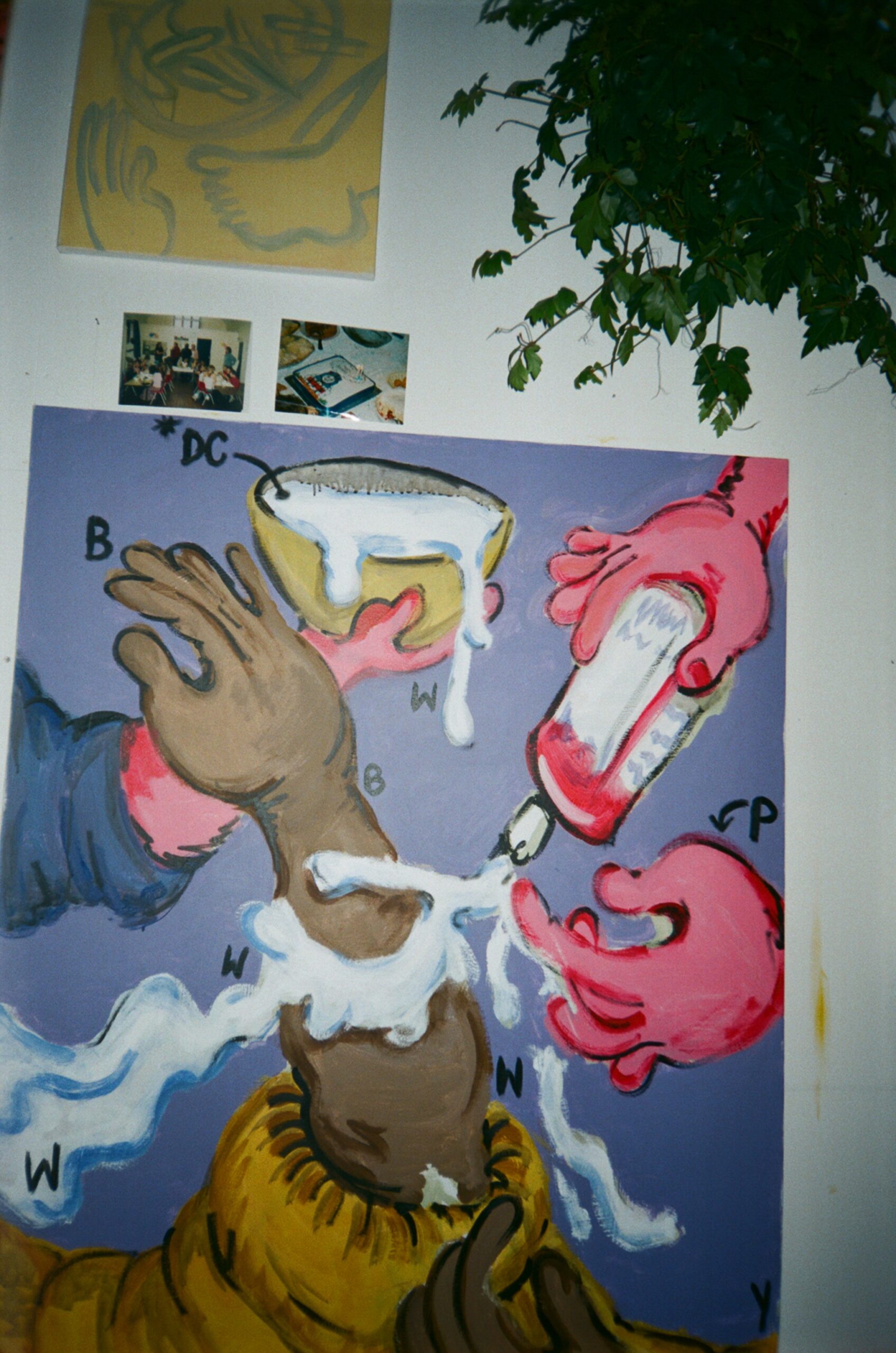
The diagram-like quality alludes to many things such as cooking instructions, food labels, Ikea instructions and painting by numbers. I enjoy having letters and numbers in the work because it emphasises what’s going on in the painting and that they stand for something logical. I hope that these puzzles provoke questions for the viewers. Modes of discrimination are absurd and nonsensical but they are also ubiquitous. My paintings always return to spelling out something nonsensical, thus slapstick scenes. Scenes that are visually ridiculous are very useful to me. I wish to always reflect the everyday abstraction of othering in the paintings.
By distributing letters as a code throughout your paintings, you allude to the common custom of speaking about race in binary terms. How do you use this hidden language to disrupt the sense of depth present in your scenes?
Absolutely, firstly the lettering came from draft sketches where I’d decide on the race of the figure with ‘B’ for black and brown or ‘W’ for white, as well as the other colours in the painting. The more I did this, the odder it became as my white figures are often pinker instead of fleshy, peachy white as pink is a silly exaggeration of white skin. So, at some point I found myself writing ‘P’ which is valid in relation to the depicted scene but not to actual skin colour. Already, a discrepancy revealed itself; not only is the word white false, it’s also soaked in supremacy as it summons ideas of cleanliness and purity. Additionally, the term casts the skin as the opposite of black just as whiteness defines itself by its lack of colour or blackness. During this moment of reflection I began to place the letters into the paintings themselves. My aims for these recent works are that viewers purposely notice the colours of the scenes I have made as they are being pointed out to them. I also see the letters as mimicking others’ understanding of race. They are signifiers of skin pigment as noted by me, however they also refer to times where people make ‘correcting’ statements based through internalised ideas that they have around race which are often formed in the binary. This is a moment when someone corrects me, or assumes something is reflected in the paintings by most figures who have an accompanying letter. Also, the idea of race in binary terms is particularly difficult for me as, although I identify as black and mixed race, I am mixed White-Black Caribbean. So, it’s hard for me to have a sense of self when we think in black-and-white terms and by extension for any person of colour living in a white-centric environment. As my work is primarily about colour—usually looking at whiteness—I think it’s important to recognise the privilege that comes with being lighter-skinned and having proximity to whiteness. While I am grateful for the response to my work, it’s also important to uplift and reference the voices of other POC artists I admire such as Emily Moore; Andrew Pierre Hart; and Jerome. Also, my work has been inspired and influenced by Donald Rodney, Marlene Smith, Faith Ringgold and incredible black curators like Bolani Tajudeen and David Lisbon.
In your recent solo exhibition ‘It Clings Like a Leech’ at Guts Gallery, the leech appears attacking the human figures whilst also being hammered and stamped out. What drew you to use the blood-sucking critter as a metaphor for racism and prejudice?
I love making concepts into villains so a leech is helpful in representing something bad that you carry with you, as simple as that is. Leeches are so invasive and shocking when you see one, there’s a panic of how you are going to get them off and a horror that they are taking something from you. The leech seemed perfect to show the persistent nature of prejudice and racism. In terms of leeches, you pluck one off your body, only to turn over and see one hidden on your side or on your back. Similarly, it feels jarring when a person you love or admire says something not politically correct or straight up racist. It’s so chilling and sometimes deeply distressing, like they have a leech on the side of their face. Sometimes, it feels like you have addressed these negative thoughts and worked on them yourself, but then something happens and you feel bad about yourself again, thus this bad feeling seemingly ‘clings’. Even when a thought naturally slips into your brain as a result of years of internalised racism/ableism/homophobia etc., you’re horrified and have to correct yourself. It’s a reminder of how sticky these internalised thoughts are. The show holds comparable similes in the paintings: sticky like jam, like treacle, like a ring that’s too tight. You look around the room and as you walk out you are blessed by the hopefulness of the last painting, a circular canvas which shows figures trying to destroy these ‘thoughts’. Here, I tried to end positively, conveying to the viewer that although sticky, these thoughts can be destroyed and removed even with great difficulty.
In many of your works you succeed in balancing the composition by framing the scenarios from uncanny angles and birds-eye views. How important are the preliminary drawings in achieving this? Are there other components that set a foundation for your painting’s visual perspective?
As mentioned with the lettering in the drafts, the preliminary sketches are so important. My work sometimes exists between being a painting and a drawing. I have got better at realising this, as the process itself often seems like the mental arithmetic of how to make paintings about race. However, even before this I get starting points from lots of different places, specifically a lot of visual art that is flat for example, 18th century caricature, heraldry symbolism, illustrated cookbooks, medieval illustrations and Warner Brother cartoons. Particularly in media where a lot has to be communicated visually. A recent painting was inspired by the Prisoner video by Miley Cyrus and Dua Lipa. Much like a Dream Wife’s video and Little Shop of Horrors, the camera angle was from inside a mouth. This painting is similarly made from the perspective of inside a party mask. Often, my paintings are headless and therefore always cropped which gives me some limitations in terms of compositions, so using objects and figures to block the faces is very helpful to me.
The use of titling appears to be particularly important for pieces occurring in specific. What is the value of language in your practice and how does it contribute to the painting?
I’d say my interest in words and expressions is how they are specific to cultures and eras. I guess in the same way that (and it might be terrible to say) Vine/TikTok and even meme culture.
It is interesting how your work handles racism and stereotypes without picturing the face of any specific subjects. In a recent interview at Tique, artist Torey Thornton comments on how removing identity from a piece of art doesn’t diminish the interwoven social themes within it. Do you think your own practice and the topics you address draw parallels with Thornton’s ideas?
Yes, absolutely. However, I think I am taking a step back, because I accept that my paintings will always be about race because everything is about sex, race etc. But I try to embrace this inevitability by painting domestic, everyday scenes with that absurd twist that signals the strangeness of othering. Currently, I don’t know whether it’s because it is normal or that I’m an alarmist or even that living with my sister hypes me up to always talk about race. Probably, because it’s my practice’s main subject matter, I think of racism all the time. What are its effects, what do people think of me when they look at me? Are people bigoted? These thoughts inform my life, as well as other marginalised peoples’. Whereas some people never think of it or any element of prejudice. So, when I stand in front of most paintings I will think about race. As a subject, it is always around even if some people don’t notice it, or think about it. This is why one aim of my faceless paintings is that by not depicting faces, the bodies can be suggested as representatives or symbols for their race rather than showing individual instances.
FUTURE
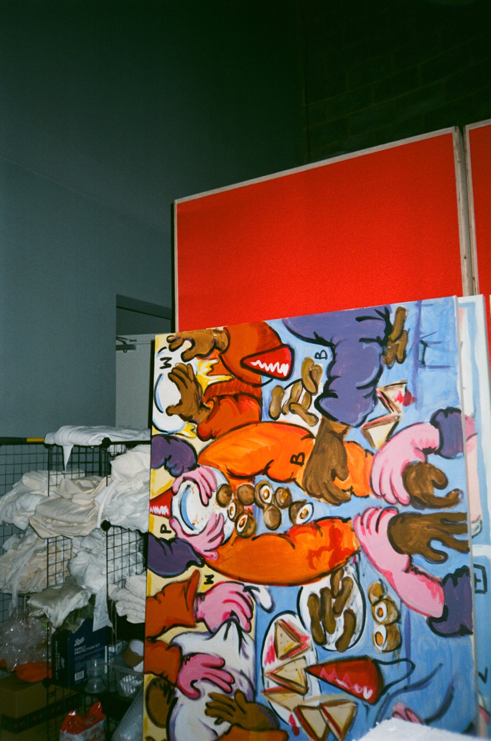
In some of the new paintings in your studio, there is a departure from more figurative metaphors to the use of quintessentially British food. Cocktail sausages, iced cakes, and scotch eggs are all somewhat nostalgic in their association with childhood parties. How are the themes of race and culture explored through this imagery?
This recent change came from my attraction to making paintings with food which occurred during the first quarantine. Thinking about it, I have always been bewitched by memento mori paintings, as well as still lifes that can be read as attributes of the artist or person they are connected to. By extension, using specific British foods feels like I am painting myself through these fatty, kitschy and often ugly foods. The paintings were born out of a yearning to feel British, and of course I am British, but Britishness is especially sparked when people come up to the paintings and talk about their personal connection to the food. The figurative metaphors that reveal a racial undertone have morphed into a focus on colour, and specifically how the way we absorb and learn about colour is as natural as how we eat food. To that end, how we eat, have parties or interact with one another is rooted in where we live. I thought it would be interesting conceptually and visually to engage with instantly recognisable icons.
Looking towards 2021, do you have any hopes for the coming year?
If we are let out of lockdown restrictions, I would like to do what everyone wants, which is to walk around freely or go on holiday. I would also love to see more captivating shows, and witness more social change. I really want to paint a lot more next year and have the chance to safely visit some of my exhibition private views in the coming months.
22.02.2021
Related