


From working for brands to creating her own brand.
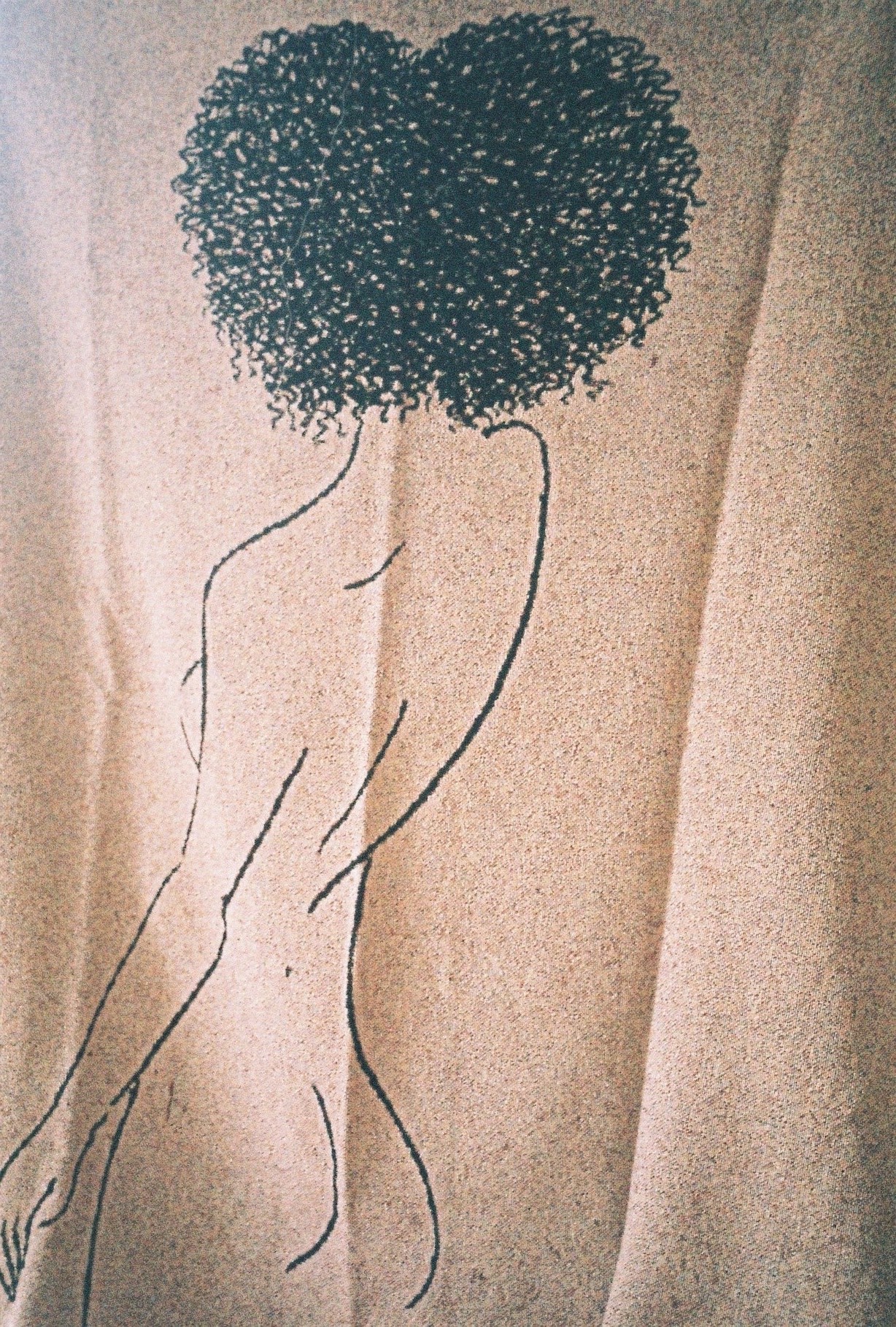
Artist Kelly Anna’s illustrations of the female form are thoroughly confident, muscular, powerful, and fierce. These are woman who undertake numerous activities, from running to weight lifting, basketball, Ping-Pong or gymnastics. “It is more about how I see women as powerful beings than anything else.” says the London based artist. This exposing of physically demanding activities and sports has long-formed the backbone of her work. Moreover, the female figures that populate Anna’s illustrations are often shown in larger-than-life settings through strong and musical marks. But while her works might feel empowering, the artist denies this vision, and rather is inclined in describing her work as an authentic expression of women. “I just draw what I see. Women are bloody fierce”, she explains. Undoubtedly, the artist’s work has found a huge audience on global companies, from running shoes to fashion brands. But the images she creates are actually their own canvas in itself, rather than just a product.
BACKGROUND
How has the transition been from working for fashion and print brands to creating your own ‘brand’ as an artist?
It’s actually been really fun. I always knew that I wanted people to see my name, not the company’s name that I was working and designing for. You don’t get any recognition when working for other brands. I wanted recognition. So, I started working 7 days a week to make sure I was pathing the way for this. It was hard, but bloody worth it.
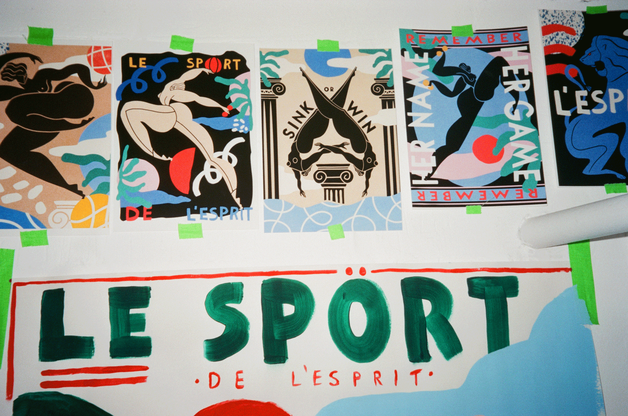
Handmade elements are combined with digital elements in your works. Can you explain your process further, from an initial sketch to a final work?
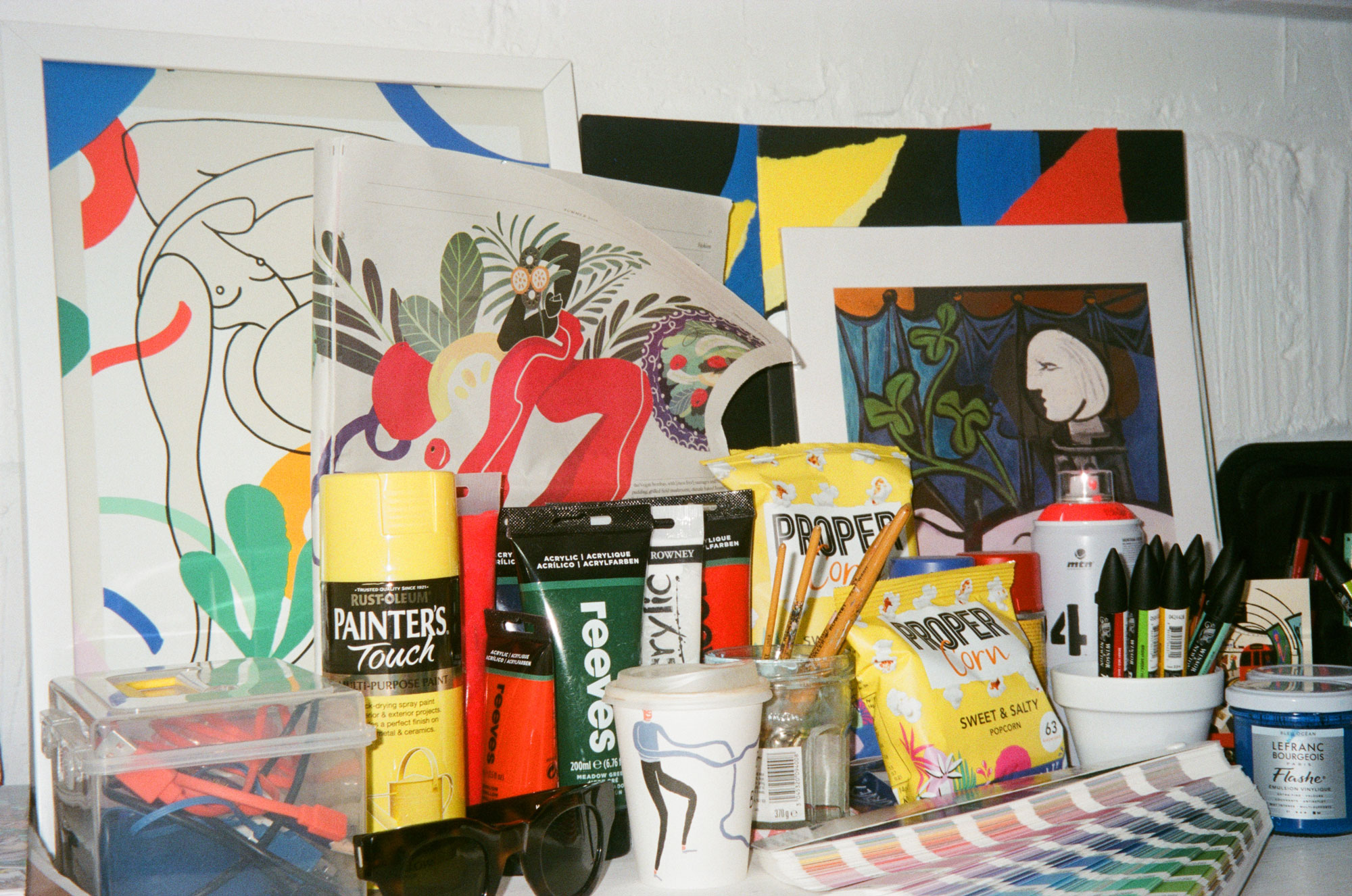
I always start out with sketching onto A1 sketchpads. I love my work to have movement in it. I will always practice just going direct to paper with a pen and letting myself get into the rhythm. Not being able to rub out mistakes just makes it more thrilling, and it relaxes you in a way, because you actually can’t do anything if the line fucks up. I will then start deciding on how I want the overall image to look and sketching mini art boards. This will then be put through the digital process.
You seem to either work in small-scale through your drawings or large-than-life scale through your murals. Can you explain us more about this approach?
I actually hadn’t done a mural before this year, and now I’ve done eight. I decided last year that I wanted to see my work on a larger scale. So, I decided to paint 4 walls at my first ever show. Such a bad idea, but it worked, and I learnt a lot. I love seeing my work blown up, it feels like that’s the scale it deserves to be.
WORK
Your figures predominantly undertake physically demanding activities – and your technique itself employs strong gestures. Can you develop on the use of movement in your overall practice?
I was bought up as a dancer. My parents met through Ballroom and Latin dancing, so rhythm and movement has always been integral to my practice. I believe that if you stand and put in the movement when you work, the viewer will feel that energy.
I believe sports come within your family’s genetics. How and why did you decide to illustrate your subjects undertaking such activities, from running to weight lifting, basketball, Ping-Pong or gymnastics?
Sports and fitness was a huge thing in my family. My Uncle was a karate champ, and my parents were dancers, so it was just what I knew. I did everything from Karate, gymnastics, swimming, and dancing. So it all just feels reminiscent of my childhood. I love bringing that side of my life into my work.
Confident slogans surround many of your illustrations, from “never tame your game” to “fuck your nerves, feel your curves”. Are you interested in using the language of propaganda in an empowering manner? Can you explain us further about the process of selecting such rhythmic words?
Whenever I am in the rhythm of creating, I’ll often just sketch down single words as I go. I work really quickly when I am sketching, collaging. Making marks so it just feels natural to jot down words. Then, as I am sketching, I will say the words in may head in different formations. I love rhythm, so it has to feel right, short, sharp, and clever.
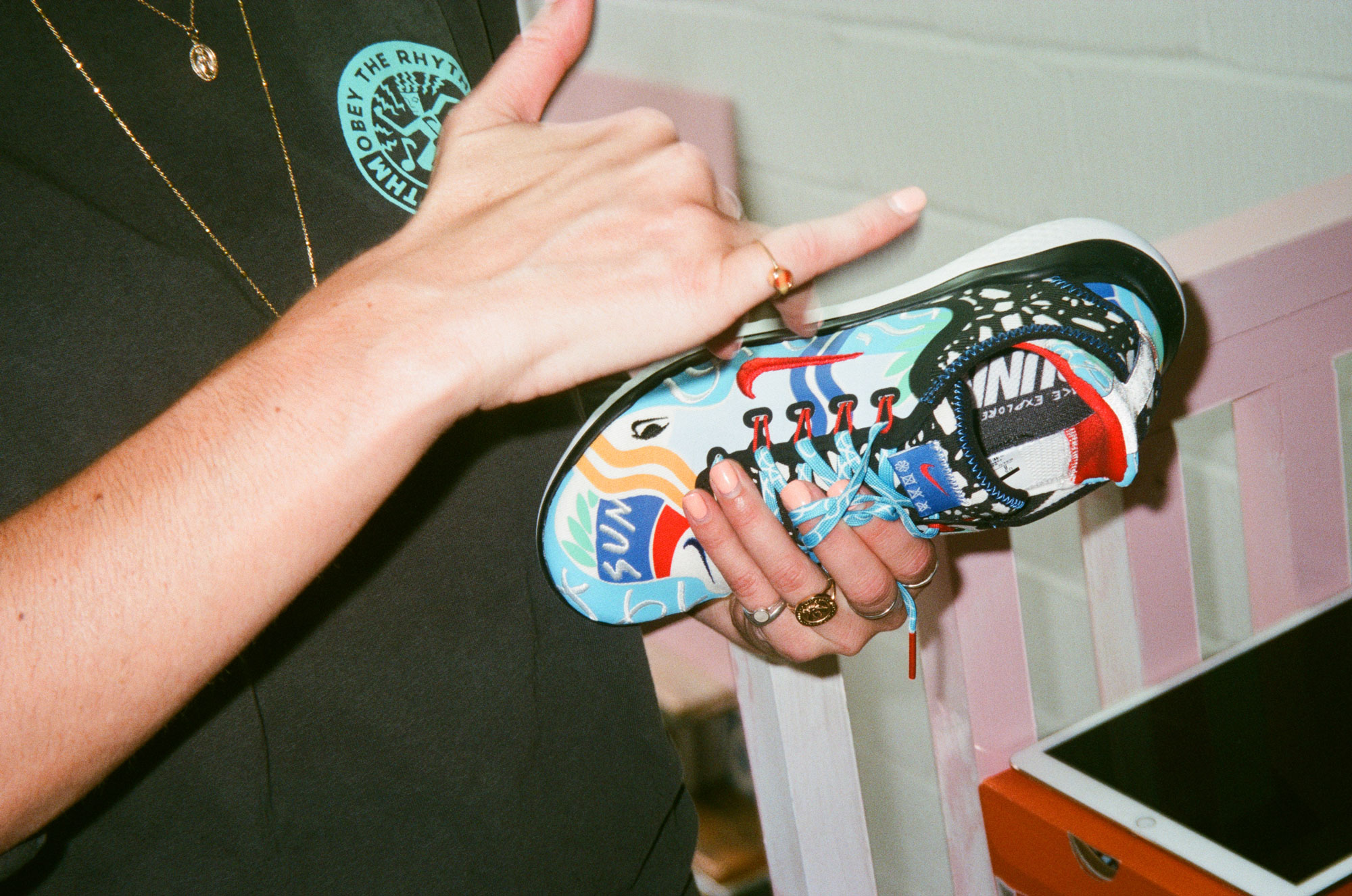
“Run Sun” was the title behind your recently commissioned Nike running shoes. What were the concept and ideas behind these trainers?
‘Run Sun’ came from the poem I wrote whilst working on the project for Nike. It was such an intense two weeks of design. I wanted to put words to it, to pull it all together. The shoes had lots of different elements to it including the eye swoosh, which was a symbol of London through my eyes – and of course the London Eye. I also created water print laces to represent the city’s pulse, the London Thames. I love looking at a product, and breaking it up into sections. Each piece should become its own canvas.
In a matter of months, your works have become successfully commercial. How has working for these clients shaped your practice and does it allow room for experimentation?
I’ve actually had so much fun on projects for Nike, ProperCorn, Equinox, Stylist and H&M, amongst others. Most of them allowed me to just create what I felt with very little edit on their side. I think that when you work for a client and there are too many edits having to take place, you really have to step back and wonder if your brands are the right fit. Edits are great when it’s a healthy collar, and it can make the product stronger, but when there are too many changes to what you’re originally feeling, its time to let it go. It’s better not to force something if it’s not right. It’s ok for that to happen sometimes.
In terms of your female subjects, they are portrayed thoroughly confident, muscular, powerful, and almost fierce. Is this a response to society’s constant strive for plastic surgery, make-up, or artificial beauty, highly publicised on social media? Are you trying to make your females more natural, and would you agree in saying that they are self-portraits of yourself?
I have always depicted the female form as powerful creatures. I have always loved exaggerated forms, I guess that came from my past in Fashion illustrating, and sketching dancers. It is more about how I see women as powerful beings than anything else. Not to get too into the whole female empowerment thing, I just draw what I see. Women are bloody fierce. We have to deal with so much, how can we be seen as these fragile creatures. It’s just not what I see.
In this context, you wrote a poem titled “who the fuck is Tom”. How did this poem initiate and what is the role of poetry in your practice?
‘Who the fuck is Tom’ came from a poem about being a tomboy. I have always loved wearing “men’s” clothing. But I just find that stupid, to have to say it’s men’s clothing. If I want to wear a t-shirt and comfy trousers with flat shoes, I am seen as un-lady like. Because I don’t want to be staggering around in three inch heels? Don’t get me wrong, I love getting dressed up, but does making me not wear heels and wearing baggy clothes a tomboy? Who the fuck is tom anyway?
The Book Club has hosted your first solo show, titled “she stole the show”, which includes immersive installations, interactive works and even functional elements such as a hand painted ping-pong table. What can you tell us about the title of the show and your humorous use of language within the exhibition? Which atmosphere were you inclined to create?
It was my first show, and so I went in. I hadn’t really been in the ‘exhibition world’ before this. I go to shows but to be completely honest, unless I really connect with the artwork and it’s thrilling, I get so bored. I hate having to be that quiet. I wanted to create more of an experience, something where people could come and have fun. So, I invited the Art of Ping-Pong to collaborate with me, and transformed the Ping-Pong room at The Book Club. We collaborated on a newly designed co working Ping-Pong table. I also created a mini basketball court. For me, art is about having fun, not walking around a quiet room with your hands behind your back.
FUTURE
When I lastly visited you, you had gone fully freelance and were preparing for an exhibition in a window gallery… Can you tell us more about this, and do you have any upcoming projects ahead?
Yes, that was for my makers residency at Wieden + Kennedy. It was called “Know the game. Play the game”. It was a project tackling adolescent anxiety and depression. I was in there for a week, and made a mural of the whole space. I will also be creating a zine from the residency that will be on sale before the end of the year.
02.05.2020
Related