


Taste, tactility and flesh.
British painter Flora Yukhnovich probes notions of ‘low-brow’ culture and femininity through painterly abstraction. In the past two years, Yukhnovich has seen a meteoric rise in success – this is not an overstatement – elite high-end galleries have welcomed her with open arms, and collectors are scrambling to procure her work. Meanwhile a younger generation of art-lovers is equally enamoured with her paintings. It’s not often that an artist can speak to as wide an audience with such ease and grace. At the age of 29, this is sometimes daunting for Flora; she is incredibly humble, almost to the point of being self-effacing. It often feels as if she is the only person unaware of her extraordinary talent. When speaking to her one gets the sense that she copes with such external pressures by totally immersing herself in her work and the process of creation itself, blocking out any outside interference by just getting on with the act of making. Flora’s success could in part be attributed to the fact that despite her young age she has formulated a uniquely singular visual language, her artworks are instantly recognisable as distinctly her own. A means of communicating that is heavily indebted to art historical traditions yet reformulated and reimagined in a completely contemporary context. Flora repeatedly derives inspiration from the Rococo, a period which has long been seen to be ‘passé,’ and it is this narrow assumption that draws her in time and time again. For Flora, the period, which is replete with images of excess, ornamentation and eroticis – notions she believes to be closely interrelated with femininity – is a means of exploring the artist’s personal experience of being a woman in the 21st century. Her works are noticeably absent of male characters; she focuses on female pleasure and by abstracting the female figures she in turn, desexualises them – they’re impossible to objectify. Her works convey elements of Epicureanism, a hedonic hunger, indulgence: “I love paint. I think it’s delicious. I find it the most thrilling, exciting stuff. I like the idea of it being excessive and luxuriating in it. And I hope that comes through in my work.”
BACKGROUND
After originally studying graphic design, you then began painting portraiture before transitioning to your current work. How have these different modalities fed in to your current practice and helped you find your specific visual language?
I studied graphic design so briefly, but it was the first time I began finding a creative process – that way of thinking still has a strong presence in my work. I’m fascinated by language and I find most of my ideas from digging into the semantics of art history. The portraiture course, on the other hand, was where I learned to paint. This is when I began to think about what paint, as a material, could communicate beyond creating an illusion. These feel like two quite different approaches but both are really integral to my way of working today.
You said that upon starting your MA at City & Guilds you asked yourself ‘what does it mean to paint today?’ Considering the evolving landscape of contemporary art, how did you reconcile and answer this question?
This is a very basic question, but I had been painting for a few years at this point without really considering that painting is an odd, archaic thing to do. I had to acknowledge that paint and canvas already carry a huge amount of art historical freight. Painting in its very nature references the past, so it felt right to explicitly borrow from art history.
How has your time at City & Guilds informed your practice today?
When I went to City & Guilds, I had learned to paint, but I didn’t know what I wanted to make. I spent the whole year trying to answer that question. I became very interested in decorative designs in wallpapers and crockery, beginning to explore the supposed divide between high and low art. I realised later that most of my interests had been underpinned by the idea of gender and how it is coded in different aesthetics. Towards the end of the course I discovered the Rococo era, by way of Fragonard, which I felt embodied that conversation between high and low and its relationship to gender.
WORK
Being attracted to referencing Rococo artists such as Boucher and Fragonard, what is it about their work that repeatedly draws you in?
I like that there’s something a little “low-brow” about the Rococo period – it’s not taken particularly seriously. I think people find it sweet and fantastical, and too much to do with excess, wealth and eroticism. I think that makes it seem a little vulgar, which is partly why I find the period so enjoyable, but there are elements that I find really unsettling. For example, many of the Rococo artists romanticise the idea of sexual conquest and depict women in a horribly objectifying way. Still, I find myself drawn to the paintings because they feel so much about paint. The paint itself feels so important as a material, looking like jewel-like globs on the surface. It feels as if the image, the material and act of painting are in harmony. These aspects keep me coming back but my impulse to critique the more problematic bits keeps the process of re-imagining these works feeling pertinent and connected to me personally.
You’ve described how your work is a culmination of high and low references, and that you believe yourself to be making essentially, distasteful work – how would you characterise the ‘distasteful’ in your art?
I’m intrigued by the idea of taste; by the way we use objects and patterns in our clothes and homes to express something of our interior selves. I also think that there are things we profess to like, or try to cultivate a taste for, in order to fit in with or impress others. And there are tastes, which we hide – because we are ashamed of how they reflect on us. The Rococo is not a popular movement, so it holds some of that tension for me. The same goes for aesthetic languages traditionally associated with women and girls. They are the languages we all grew up with in toys and films etc. and learnt to identify with and yet they often lack the scope to express the range and complexity of the way we actually see ourselves. So for me, the feminine also has this conflict built into it – the oscillation between pleasure and shame is a recurring theme in my work.
When working with art historical painting references, contemporary advertising and women’s magazines, how does your mind and hand integrate and explore the various sources?
I’m interested in the way the Rococo style is used in consumer culture, so I’m looking for imagery with strong Rococo influences, or vice versa, Rococo imagery which feels contemporary. As such, there is already a similarity between old and new in the sources I choose. Making my paintings is my way of exploring what connects them. I copy a lot to learn from the imagery so I can then manipulate it, still maintaining a resemblance to the original. I often make quick little studies of paintings, to learn the colours and composition. I’ve also spent time copying Disney cartoons to absorb the fluid, yet contrived feel of the line, and I find it comes out in my painting afterwards, even when I’m dealing with 18th century source material. I think that’s how it is with painting, once you have the vocabulary in your hand, it can come through intuitively when a language enters your mind.
Having spoken before about the use of pinks and purples in your palette, and the way in which you gravitate to female or feminine figures, where do you think these preferences derive from?
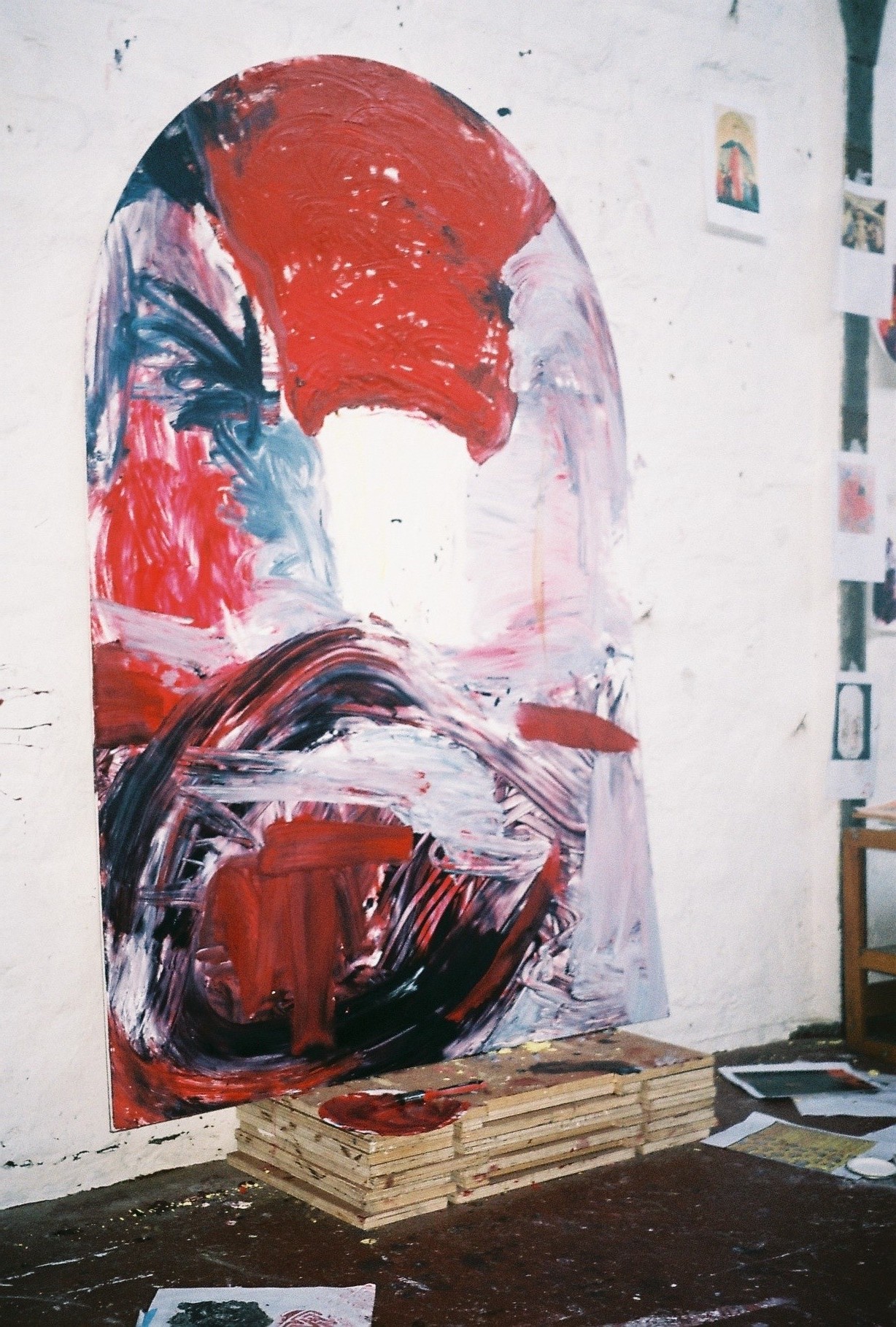
Pink is important to me for lots of reasons. It’s really the quintessential colour of the Rococo era. It is also obviously the universal signifier for femaleness so it’s always there in my sources. For my paintings I find its ambiguity very useful. It feels synthetic, like Barbie dolls and princesses – it speaks of a constructed ideal of femininity. And yet it’s also a very natural colour, the colour of flesh. My work is often about combining a constructed, artificial vision of women with something which feels more real. I think pink naturally sits somewhere between the two.
Your work is gradually becoming more abstract, but particularly with your larger pieces where the viewer is able to discern human figures when seen from afar; this fleshiness seems to be important to you, why so?
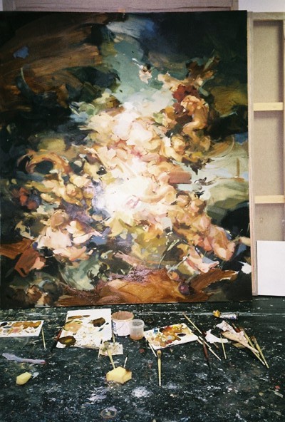
I learned to paint through portraiture and I’m sure that will have informed my approach. But beyond that, fleshiness is just so much a part of painting. Painting uses the body, leaving a trace of one’s physicality, and way of moving. I also think that the material itself feels corporeal in a way. My work is about taking decorative languages, which are apparently superficial, considered ‘icing on the cake’, and thinking about how to draw out the substance. Using the natural bodiless of painting is often my way of doing that because it’s universal – we all live in a body. I think it has the capacity to speak in a very visceral and therefore relatable way.
At your studio, you also mentioned how you tend to paint then photograph then photoshop and then paint again, constantly alternating between physical and digital practices – how does this inform your process?
Digitally manipulating photos of the work really helps me through the process. I can work out where a mark should go on a painting, what the colours, pace, and scale might be, in a place where I can easily erase it, or try lots of different variations. It just compartmentalises the process so I can be more decisive when it comes to actually putting paint on canvas.
Whilst creating works on your recent residencies with the Great Women Artists x Palazzo Monti and Victoria Miró, how did the different environments impact your artistic output?
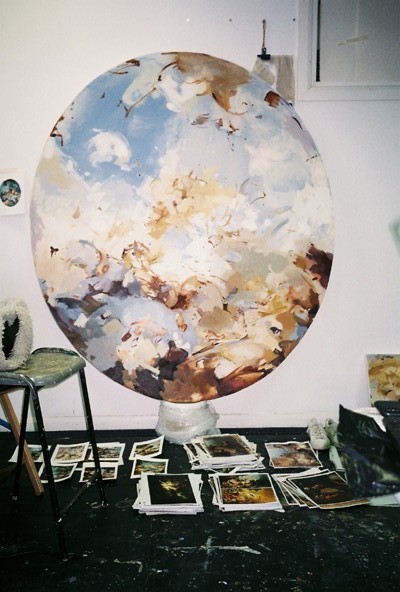
With the Wallace Collection so close in London, I’d mostly looked at the French Rococo. Spending time in Italy opened my eyes to another equally extravagant and playful version of Rococo painting. I began making work responding to Giambattista Tiepolo after I visited Venice at the start of the The Great Women Artists x Palazzo Monti residency. Because of their scale, it feels important to spend time under those frescos, to look at them from different angles and to see them at various points in the day when the sun lights them from different directions. You just can’t get that from reproduction, so I was dying to go back and study them properly. I was very lucky to be able to spend 11 weeks in Venice doing just that on a residency with Victoria Miro. Most of my work has been based on historical oil paintings, which tend to have a yellowish hue because of the varnish. The frescos in Italy have a dusty coolness to them, which definitely influenced my palette. I found myself using purer blues, rather than warm turquoises in the paintings I made there. I also think that the French paintings focus on form and fleshiness, whereas the Italian frescoes are more about space and the way the viewer digests it. Studying paintings in Venice taught me a different way of structuring a composition by using planes of space which I hope to bring into my work.
Natural light appears to be integral to your way of working, which is a rarity these days. In what ways is it important for your process?
I just think it’s easier to see subtle colour shifts in a painting in daylight. Electric light has a bit of a flattening effect so I tend to be unpleasantly surprised in the morning if I’ve painted late the night before.
FUTURE
What are you currently working on?
I moved my studio home for lockdown. At the moment, I’m slowly moving back. I’m just really looking forward to having the space to make some big work again.
Does working to a deadline suit you? Or are you looking forward to a time where you’ll have more of an opportunity to experiment more freely?
I like a bit of both. It’s nice to have the freedom at the start of a body of work to determine what direction it might take. But a deadline definitely helps me finish and let go, otherwise I could go on revising a painting almost indefinitely.
06.06.2020
Related