


Intentionally designing symbols that appear as found.
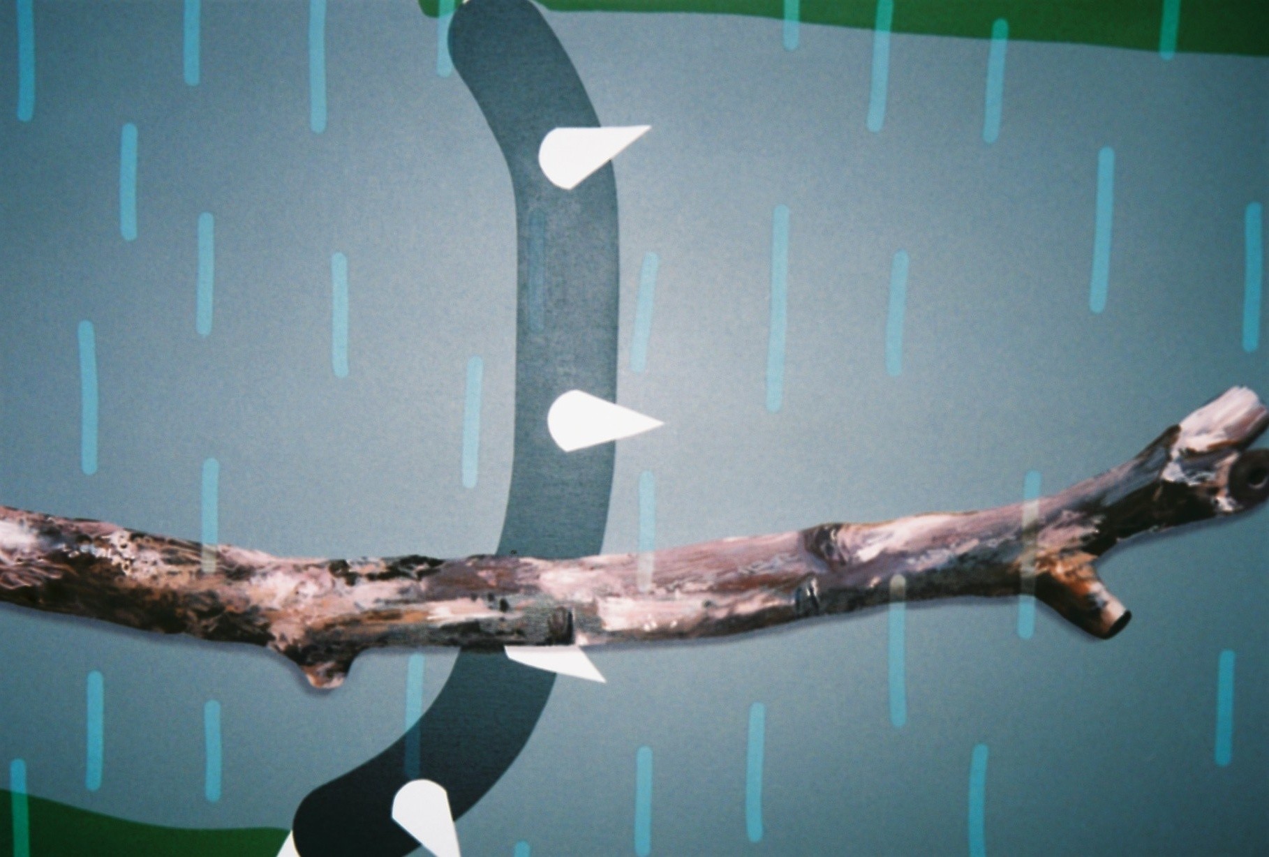
Artist Robin Seir juxtaposes a strict geometric language with the lively richness of a brushstroke in his recent exhibition at Union Gallery. His painting practice itself is homage to aesthetics: a realm that increases its complexity as the use of cultural and historical signifiers develops. In response, each of his formulated symbols are reminiscent to particular associations – yet are kept to their basics in order to guarantee a slight sense of anonymity. Besides his use of bold representations, the artist confuses us with his copper and silver palette, colours which are immediately associated to specific materials. “I’ve always been drawn to questions about how aesthetics operate, how aesthetic cognition and conditioning arise.” Robin mentions. Every mark begs for a deeper consideration – and we speak to the artist to resolve these contradictions.
BACKGROUND
Having grown up in Sweden- known for its weight in minimalist design and aesthetics, would you say your roots have influenced your practice?
Aesthetically, it used to have a central role to my practice, as I’m a great fan of Swedish post-war art and design. Over time, I developed a painting practice, which is more concerned with the aesthetics and the formal style of explicit communication often found in the realms of iconography, commercial imagery, tattoo culture, and political & religious symbolism. Having said that, there is still a direct link to design, but perhaps more specifically graphic design. The problem with graphic design is that it’s immediately associated with modern mass culture, logotypes and typography. I’m looking just as much at pre-modern ‘graphic design’ like pagan symbolism, islamic ornamentalism, Korean quilts and Egyptian hieroglyphs.
You’ve studied at Universität der Künste, Berlin; at Chelsea College of Arts and Design, and at the Royal Academy Schools. What are your views on the art education you’ve received in both Berlin and London?
They are very different places to study in, as much from an educational as a cultural point of view. Having my background in Sweden, I’ve always been interested in the differences proposed by different cultures regarding artistic training. What I really like about the UK is the great rotation of tutors, visiting artists and lecturers which all prevent the risk of idolising your tutor/lecturer/professor. This, in turn, generates a critical and constructive environment in which one is free to contradict one another.
WORK
I understand your practice is very much painting-based. Do you enjoy the restrictions of this medium?
I’d say the very core of my work is aesthetics. I’ve always been drawn to questions about how aesthetics operate, how aesthetic cognition and conditioning arise. This could of course be dealt with and presented in any potential medium there is. The medium of painting is ancient and has a direct, inseparable relation to the history of image making, which I really love. Restriction is loyalty.
I had a chance to look around your previous works when visiting your studio and spotted that they feel neater and more minimal – as if flirting with modernist aesthetics and design. How has your practice transitioned from a more minimal perspective to more surface-based works?
The flat neatness contra the more textural richness have in various proportions always been present in my work. I think my small monochromatic relief paintings summarise this quite well, by juxtaposing a highly strict geometric language with the lively richness of a brushstroke. My more recent large works have a lot of stuff imbedded in the paint. This often invites the viewer to see the micro cosmos upon which the bold, flat elements are painted.
You have recently exhibited at Union Gallery alongside artist Jenny Brosinski. Was this a conscious decision? In what ways do your practices feed each other’s?
Jenny contacted me last Autumn and asked to visit my studio, which resulted in some vague plans and a friendship. Together with William Gustafsson from Union Gallery, we worked something out together throughout Spring, which resulted in our show. Both William and Jenny have been great to work with professionally as well as on a more personal level. In regards to the show, I somehow find our painting practices equally as synchronised as they are inharmonious. There’s an exchange in terms of the raw and the controlled, the gestural and the designed.
Aesthetics seems to be at the core of your practice. What drives you to this strong visual interest? Is it a response to today’s culture – very much linked to the continuous absorption of visual imagery?
I think that I’m drawn the fact the realm of aesthetics only gets more and more complex as the use of cultural and historical signifiers accelerate. I can really appreciate the simplicity and honesty found in ancient symbolism and use of signs in the same way that I can appreciate painting as a very primitive medium of creating an image or a picture.
Symbols are central to your practice. Are there certain connotations attached to these symbols? There seems to be a use of recurring symbols – why are you drawn to the repetition of certain motifs?
Since finishing the Royal Academy Schools in 2016 my main preoccupation has been the aesthetic and stylistic qualities of communicative and cognitive agents. I’m interested in how a style can compliment, reduce, contradict or interfere with a given meaning. And how meanings depend on the inevitable process of visual conditioning. History plays a central role here, in which a unit of information is enhanced, diluted, associated, confused or specified over time. The symbols I use are not found but designed. On the other hand, they are intentionally designed to have some kind of associative quality and might sometimes do appear as found. In addition to this, I keep them very simple in order to guarantee a slight sense of anonymity. For the sake of contradiction, I use them over and over again in which a narrative unfolds and they condition one another.
In terms of repetition, you mention “it’s a challenge to keep doing the same, without loosing interest”. Are you concerned in playing with the limits of repetition? Would you agree in saying that this recurrence of shapes or patterns enables your work to have a substantial mechanical feel?
I don’t involve a process of repetition for the sake of repetition in my work. There are so many artists who have done that and it usually ends up in this quite familiar competition that favors quantity over quality. Having said that, I find the blind ambition to change and ‘challenge oneself’ an exhausted cliché, not rarely found in art education. The frequency of appearance is key in order to elevate an entity’s associative or cognitive quality. So, I guess repetition is fundamental to the process of conditioning, yes, but I’m not playing with any boundaries in terms of how far one can take something. There are interesting grey zones in which visual entities move from various degrees of being autonomous, associative, and cognitive. Especially together with the cultural and historical aspects our understanding of things rest on. In similarity to what was mentioned earlier on, with juxtaposing a highly strict geometric language with the lively richness of a brushstroke, – I think the mechanic feel of repetition in my work is juxtaposed and played around with the inconsistency and uniqueness painting often is associated with.
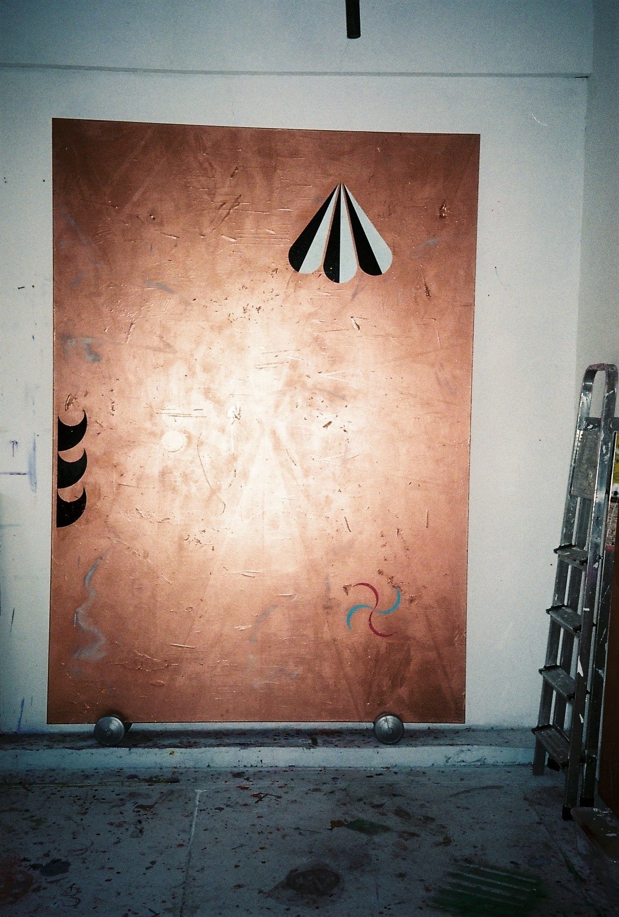
You’ve been working your “Relief” works for a long time. Can you explain how this series initiated and why you have persisted in its continuation?
I made my very first relief painting as a result of a mistake in Berlin in 2012. It’s a large monochromatic silver painting that I much later came to title ‘Initium’. It’s still in my studio here in London, as I refuse to let go of it. It’s basically the only painting I will always keep to myself. The mother if you like. Since then, I’ve made relief paintings in various sizes but mainly stuck to a small format of 40 x 30 cm. From 2014 to 2018 I almost only made copper ones, and from the start of 2018 onwards I’m back on silver again, but this time with the small addition of artist frames. Surely repetition is important here, as I believe some kind of intrinsic value is created over time. Each painting relates to the others as a whole but each painting is completely unique as each brushstroke is considered and amplified using very thick paint.
I am very curious about your choice of palette, in particular, your use of copper and silver. These colours have immediate connotations to specific materials. Are you trying to re-direct these connotations and try to make us focus purely on the colour itself?
I was curious to use a ‘colour’ that immediately directs the viewer’s association to a specific reference, which in this case is a metal. All colours operate of course somewhere between the two extremes of the autonomous and the let’s say ‘instrumental’. What I like about copper and silver chrome is that they seem to come across equally industrial as well as precious. The silver works have a much more clinical and sterile feel to them, while the copper works have much greater warmth and depth. I find them pretty complimentary.
FUTURE
I can see an inclination towards a handmade and sense of touch in your works. Towards which directions are you working on?
It’s hard for me to tell but looking at my work it tends to get scruffier and more worked on than it used to be. It’s quite a process getting a surface and finish I want. Then there’s always a matter of developing the components within the picture that somehow toy with the grey zones in which visual entities exist in.
Do you have any upcoming projects or exhibitions ahead that you can share with us?
I do have a few shows scheduled but will leave it at that.
15.06.18
Related