


From sad to bad, Hetty Douglas talks on innocence, sexuality, and truths.
There’s an undiscovered side to London-based artist Hetty Douglas. This is made abundantly clear in her new work “Sad n Bad”, where the artist juxtaposes the terms “Sad” and “Bad”, unhappy and nasty, while painting the entire background of the canvas, leaving no uncovered or untouched surfaces that the viewer can look into. Her new work in process is also confusing. At first glance, it seems welcoming due to the joyful smiley face sticked onto it’s shiny black surface, although at a closer inspection, you are forced to see your own reflection when looking into this work. “It is ironically, very glossy and quite literally smiley, but it’s also the darkest work I’ve ever made.” The artist carefully plays with the depth of the seducing glossy colour, making you think you can dive into the work in advance of colliding with it. “I think that going through something that’s quite emotionally challenging, naturally the work you make just changes.” With so much to consider, we checked in with Hetty to learn more about her new works in progress.

BACKGROUND
Your mother is an artist. Did you decide to make art due to your family’s input? How much of an influence do your relatives have upon you?
I remember going into college with my mum when she was on a foundation course, then Loughborough University, where she studied. I was always painting, drawing, or messing around in her studios – it was a blessing to be exposed to such creativity at such a young age. I think pretty much the whole of my mum’s side of the family are creative in some way, so I’ve always been around it, and always been supported by them within my practice. My mum is not only a great artist, but has an admirable eye for interior and impeccable style (she’d hate me saying this) so a lot of my creative interests are influenced from her, be it design, clothing, architecture, etc.
You studied fashion illustration at London College of Fashion, mainly due to wanting to come to London to live. Do you believe any of your fashion illustration notions translate into your works?
No – I was very young when I moved to London. I came straight from a BTEC, in hindsight, I maybe would have done a foundation and matured more in my work before moving here, but figuring out what you definitely don’t want to do (which university taught me) is just as important as knowing exactly where you do want to take your work, I think.
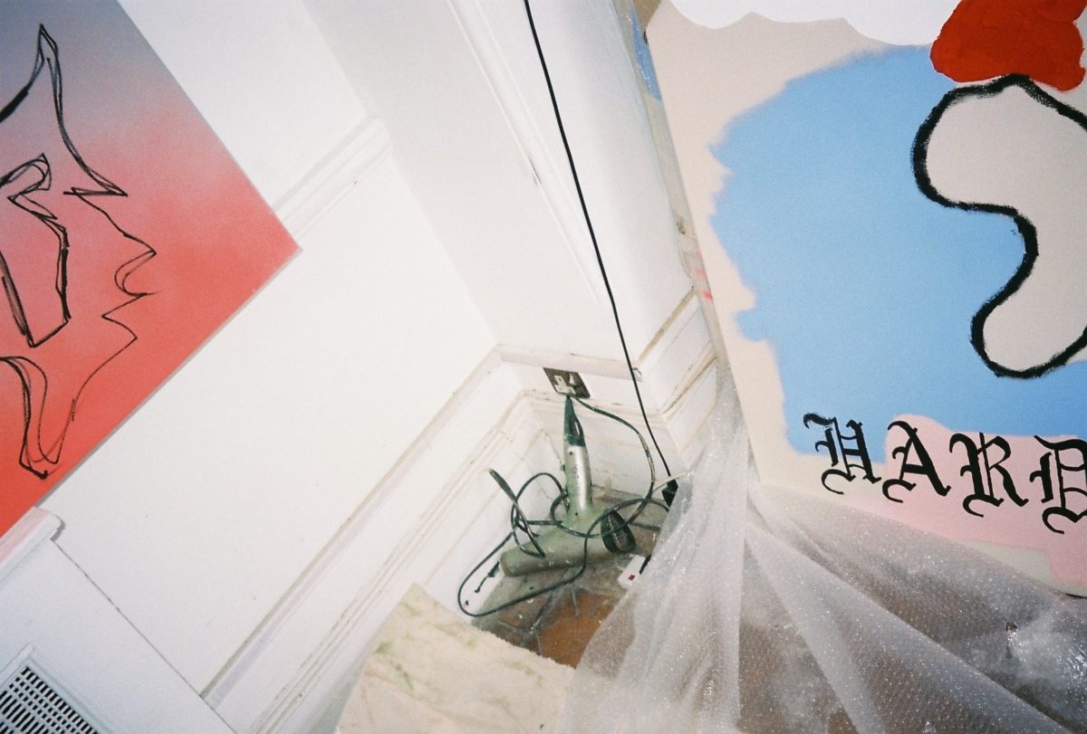
Your studio space is located in a dumped building in Borough, London. How much does your working space mould your practice?
Well you can only make as big as your space allows you to. If I had more space, I’d probably make larger scale work, I don’t know, maybe I wouldn’t?. It’s a great space but quickly being taken over by flat iron square next door, which is annoying, and I doubt we will have the space for much longer, I guess London NEEDS another street food market though hey…
WORK
The works you have previously made revealed the canvas linen without being painted, in a raw state. In contrast, your current works are inclined to cover the entire background of the canvas, leaving no ‘uncovered’ surfaces that the viewer can look into. Why have you decided to not revel the ‘untouched’ state of the canvas?
Maybe I don’t want to feel exposed right now

Childish references are apparent in your pieces, although this ‘innocent’ approach is sometimes coated under a darker twist. Could you explain this further?
I think that looking back at my latest exhibition “Good Luck”, once the works were all together at Cob Gallery and Studios, I realised they do have childish, slightly immature elements to them. With the hang man references in “Good Girl”, and the primary colours used through out- it’s interesting I didn’t really see this until I stood back and saw them all together. I think that perhaps the childish references also partially come from the simplicity of my chosen text, but the darker twist is somewhat added by the fact that some of them have sexual connotations. There are connotations that I understand and know about (which I probably don’t need to go into), but at first glance I don’t think a viewer would pick up on.
Layering is an important element within your works. You don’t superpose layers precisely on top of each other, but rather place elements above others in coats of paint that dry and heal. Could you explain your layering process further and why it is important for the meaning of your work?
A lot of my works do have layers of paint precisely on top of each other. In my older works, I’d often add elements of text and then paint over it. I like the idea of there being something underneath a layer of paint or several layers, that only I know about. I use mediums such as plaster, pollyfiller, and cement. I use these solid, harsh materials not only for there texture and depth, but because they remind me of things that I see on a day to day basis that aesthetically please me or inspire me. For example, my “1992” painting – this has cement on it with the letters “H E T” drawn in using my finger, like how you see in the street when new cement has been laid, often there’s scribbles in the wet cement that later dry and become a permanent mark in the path.

In relation to your painting process, you start a work once you have figured out the colours, and the work develops from there. Do certain colours have determined meanings to you? Is the use of colour linked to your mood?
The main thing I am certain of when going into a new piece is which colour scheme I want to use. I think this is directly linked to my current mood / feelings- and a subject naturally comes from that mood. For example, I use a lot of shades of blue, as for me it’s a colour of love and safety and my relationship, it’s also the name I’d like to call my child (don’t ask). It represents goodness, and what love looks like. It’s interesting because it’s a colour often associated with feeling sad. It’s such a happy colour for me.
FUTURE
Which artists are you influenced by and why?
David Ostrowski, Trudy Benson, Ida Ekblad, Gorky, Eddie Martinez, De Kooning, Mafia Tabak, Alfie Kungu, Timur Si-Quin, etc…

In reference to your works, in what direction do you see them going to? We have seen a sneak peak of a very glossy “smiley face” unfinished work. What can you say about this new piece?
I think going through something that’s quite emotionally challenging, naturally the work you make just changes. It is ironically, very glossy and quite literally smiley, but it’s also the darkest work I’ve ever made with a jet-black background, and no raw canvas on show. You can actually see your own reflection in it.
You have previously mentioned you would like to change environments, and are inclined to travelling the USA. Is this something you have in mind?
Yes, I’d love to show outside of the UK next year, or do a residency… I’m doing a couple of group shows in London but I’d like to try and venture out as well, I’m getting a bit sick of London. As much as I love London, it’s a difficult and challenging place to live, especially as a creative. It’s hard work, and there’s a lot of people ready to chew you up, and spit you out. I’m not necessarily only looking at the US, I’m just feeling very open to new places at the minute- an adventure!
01.12.17
Related